#the action the psd...... so ugly
Explore tagged Tumblr posts
Photo


Yuzuru Hanyu // 2017 World Championships - Free Skating
#yuzuru hanyu#worlds2017#figure skating#mine#hope and legacy#hope & legacy#one of my fav programs!!!!#also i didnt know how to put the 'right' caption#forgive me yall im new#the action the psd...... so ugly#im trying my best
302 notes
·
View notes
Photo

blurry edges action set: download
i always get asked how i achieve my blurred/faded edges on my photos, so i finally made a quick action set for you all.
there are three sizes (which are personally my most used): square: 900 x 900 rectangle: 1280 x 800 & 1280 x 720
IMPORTANT: before you run the action on your FINISHED, FLATTENED screenshot, make sure your layer is UNLOCKED or the action will not properly work.
enjoy. :o)
#ts4 action#ts4 psd#ts4 download#photoshop action#the pic for this is so ugly but it doesnt matter ok
756 notes
·
View notes
Text

SCHAFER’S GIFFING TUTORIAL
hello guys! since im doing followers celebration and i think “why not make a gif tutorial too?” i started making gifs around this time last year, and here’s my giffing tutorial!
this tutorial will have basic giffing + coloring tutorials!
BEFORE YOU START:
make sure your video is at least 1080p, i always use 1080p video for my gifs, i think mkv works better than mp4, but it works either way.
filesize can be really big like almost 30gb if you’re giffing from a movie, so it’d be better if you have an external drive to save your files.
i use potplayer to screencap, pls download it from their official site, you dont want to get virus on your laptop.
i use photoshop cc 2019
STEP 1: LOAD YOUR SCREENCAPS IN
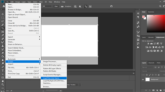
go to File > Scripts > Load Files Into Stack then a window will show up tell you to choose your files
STEP 2: CONVERT VIDEO TIMELINE
click “Convert video timeline” then click three little boxes on the left corner in the pic.

STEP 3: REVERSE YOUR SCREENCAPS
once you converted to video timeline,
1. click three little lines highlighted by red box, then click “make frames from layers”
2. click three little lines again then click “select all frames”
3. click three little lines again then click “reverse frames” (cause when you converted your screencaps to video timeline, it’s reverse, so you need to do this step to reverse it back)

STEP 4: CHANGE YOUR GIF SPEED
i think .05 works the best since .04 is too fast and .06 is too slow.

STEP 5: CROP AND RESIZE
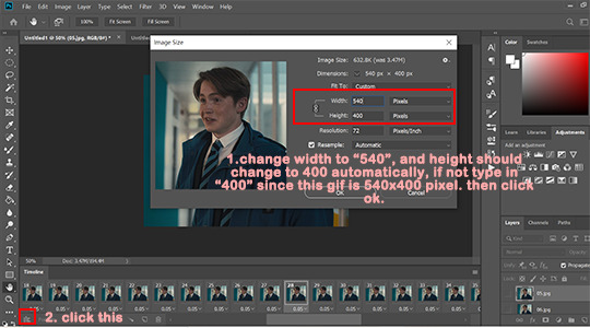
most of my gifs are 540x610px or 540x400px, but sometimes i do 540x540px too. whatever you choose, pls make sure that width is 540px. in this tutorial, i go with 540x400px.

once you cropped your gif, go to Image > Image size > set width to 540 pixels and height to 400pixels, it should change to 400px automatically when you typed 540 into width but if not type 400px manually.
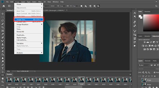
then click okay and click three little boxes on the left corner.
STEP 6: SHARPENING
go to Select > All Layers, and click three little lines on the right > convert to smart object.
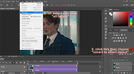
after you converted your gif to smart object, go to Filter > Sharpen > Smart sharpen.
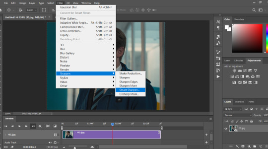
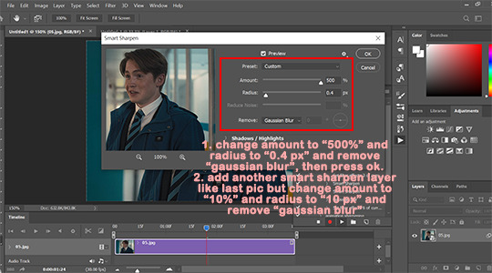
my personal sharpening setting has six layers in total, we’ll be adding two smart sharpen layers first.
layer one: amount: 500%, radius: 0.4px, remove: gaussian blur
then click okay and add another smart sharpen layer.
layer two: amount: 10%, radius: 10px, remove: gaussian blur
then click okay
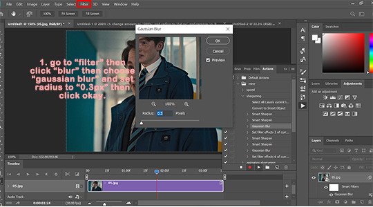
next, go to Filter > Blur > Gaussian Blur > set radius to: 0.3px then click okay.
then add two more smart sharpen layers and one more gaussian blur layer
layer 3: amount: 500%, radius: 0.3px, remove: gaussian blur
layer 4: amount: 5%, radius: 5px, remove: gaussian blur
blur layer 2: radius: 0.3px
i ususally do step 1 to 6 with action so it saves me a lot of time since once you made an action, you only need to click play action.
STEP 7: COLORING
before we start, i wanted to say that there is no correct way to color gifs, so my coloring process may not be suitable for everyone. and i dont use psd, i color every single gif by hand since every gif has different lightning.
i ususally go from 1 to 5
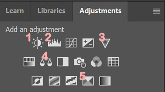
1. Brightness/Contrast
i usually only adjust contrast unless the gif is super dark, my contrast is usually around 20-40 depending on the gifs.

2. Levels
levels is basically lifesaver and where you make most dramatic change here, like if the gifs is super dark or yellow, this is where you fix them.
i use black dropper to click on the darkest part in the gif and white dropper to click on the lightest part in the gif.
and remember that some scenes are just really dark, don’t over do it, it’ll make your gif look terrible.

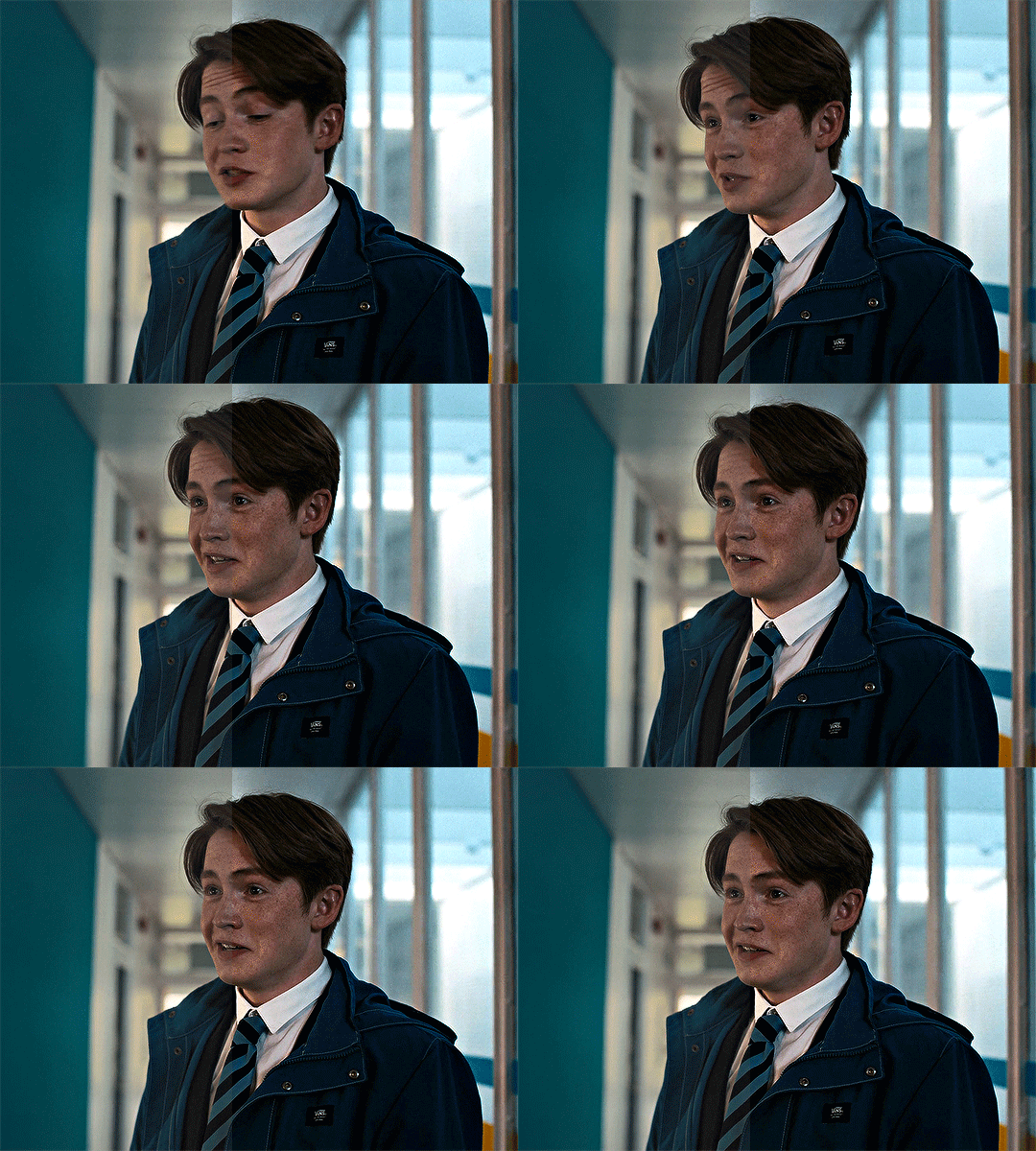
before/after Levels:
you can see that we remove the ugly yellow and brighten it.
3. Vibrance
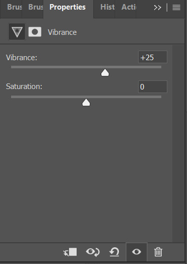
i only adjust Vibrance, usually around 20-35, sometimes i’d adjust saturation too. and pls DO NOT OVER SATURATE IT, over-saturated gif will look lousy and terrible if youre not making smaller gifs like 268x268px
4. Color balance
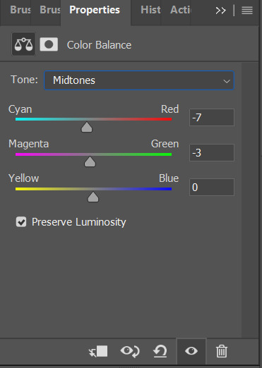
i like my gifs look white/blue/cold ish, and here is where i cast the spell i mean make adjustment.

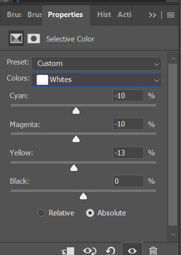
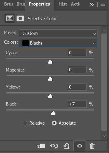
5. Seletive color
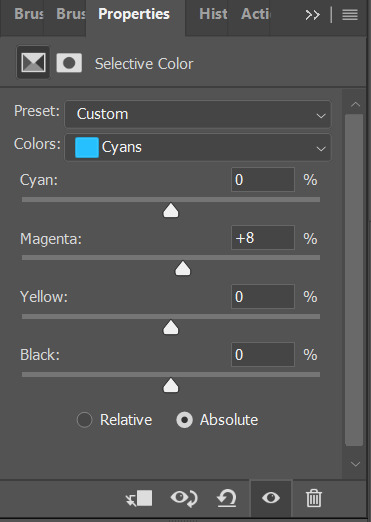
most of the time i only mess around with color black and white here, black: to add more contrast, white: to make white even brighter. sometimes i’d adjust color red too, if a charater’s face is too red, adjust color red’ cyan.
STEP 8: EXPORT YOUR GIF
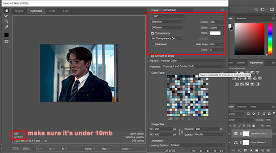
go to File > Export > Save for Web (legacy)

make sure your gif is under 10mb since 10mb it’s tumblr’s gif size limit, and you can only post ten gifs in a post.
my save settings is usually Selective and Diffusion, and make sure transparency is checked.
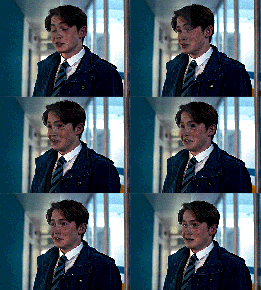
here’s the result:
that’s all! if you have any question pls don’t hesitate to send me an ask!!
#gif tutorial#ps tutorials#coloring tutorial#tuserkay#userrlucie#userrsun#usermarcy#userhers#userkarlo#userannalise#olivialook#userkosmos#userkarolina#userkraina#tuserheidi#userauden#usersem#***#*tutorial
303 notes
·
View notes
Note
can i ask how you color and sharpen your gifs? they’re so vibrant 👀
Of course! I don't know how helpful I can be because I don't do anything special, so this is mostly an incoherent ramble and offers absolutely no insight. There's so many amazing coloring tutorials out there, so I would recommend any of those rather than reading the jumble of words below the read more lmao. The best resource ever is this blog. You can find tutorials for everything ever.
First, I crop by using width x height x resolution rather than just plain cropping and then resizing the image. I have no idea if that actually makes a difference in the quality, but I've gaslit myself into believing it's a difference maker. My settings are usually 542 px x 400 px at 135 px/in. The reason I do 542 is because then I go into canvas size and do 540 x 398 to cut off those tiny transparent borders that always show up after you crop (I don't think it's noticeable at all when you upload a gif but I'm just in the habit of doing it). Once it's cropped, I flatten my frames into layers and use a sharpening action. I have no idea what tutorial and specific sharpening action I downloaded because it was years ago, but there's so many out there. Here's just some random ones I found, but there's a lot if they don't work for you [x, x, x].
As for coloring, I color every gif from scratch each time. I know a lot of people use PSDs, and then might alter them slightly based on the gif. That looks great and is faster and works very well, and it can be a great option for you to seek out. I'm just a control freak who wants to manually adjust everything.
Gifs with a dark or solid, colorful background are my favorite to color because it's so much easier to make the person stand out. I can just talk you through my mindset for this gifset.
I used exposure, brightness/contrast, selective color, color balance, vibrance, and levels. Exposure was +.53 and offset was -.0015 (I like using offest and gamma correction when I have a very dark background I want to emphasize, but I keep them at very very very low levels). Brightness was 9, contrast 7. I don't really like using brightness/contrast too much, but a little contrast in the right color conditions does sometimes make things more visually interesting. Selective color in black under the black subheading was +26. I go wild to make a dark background darker. If it had been a pretty blue background, however, I would've been in the blue and cyans section just messing with the sliders until I got a nice shade of blue I liked, and then I would've gone to the blues under hue/saturation to make it even brighter. I didn't use any 'selective color: neutrals' on this gifset, and I kind of avoid them because it's really easy to wash someone out or give the gifset a kind of ugly color tone if you're not very cautious.
Specific color balance numbers would be annoying for you to read through, but make sure you work with all 3 of the shadows, midtones, and highlights. I almost never go more than a +/- 5 on any of the sections, and I always hide the layer after to make sure I actually like the colors I added because you might accidentally take a totally normal gif and suddenly, all the blacks are looking magenta toned because you went too wild in color balance. I just added a tiny bit of vibrance (+8) to make sure I wasn't washing him out, and then I finished off messing with levels to once again emphasize the dark background.
90% of the gif coloring I do is done in exposure, selective color, and color balance. Those three are the backbone of my gifmaking. I spend so much time messing around in selective color with all the standout colors in the gif. I wish I could drop a magic secret here, but I really just go through and adjust the sliders until I find a balance I like.
I think color balance is so important to making sure the person isn't a weird shade after you mess with other colors - it ensures sure they're not super yellow or overly cool-toned. When I have a colorful background that isn't a red/yellow/orange (because messing with those colors will mess with a person's skintone), I also usually make it brighter through selective coloring and hue/saturation. I cannot emphasize enough how much selective coloring changed my life. It's my world. When I finally do upload my gifs, I always save them to my drafts and view them from mobile and desktop to see if there's anything that looks super weird that I need to fix. Sometimes a gif will look great in photoshop but suddenly the person is bright red on mobile, so it helps me make adjustments.
I used to be very conservative in adding lots of color and I tended to wash people out and was too afraid to make a colorful background even brighter or a dark background darker. For example: this old gifest I made on my main just looks so .. dull? There's no life in that skin. What I would do differently now, just as a basic starting point, is brighten the blues and the reds in his skin through selective color + hue/saturation, add more exposure, and use color balance to make his skin tone more human. With just those adjustments alone on top of the gif (which did already have coloring on it!), it looks way better and brighter. I mean, does it look good? No, it's a screenshot of a gif from almost 2 years ago and I spent 30 seconds on it, but it's better!
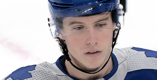
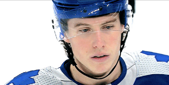
My advice is just to not be afraid to mess with colors and make them stand out. I have zero comprehension of color theory and no artistic background, so I was flying blind when I started adding all these adjustment layers and was very timid about them. I really just think the best thing to do is to mess around in photoshop working on gifs with different colored backgrounds so you practice how you want to mess with those colors. I seriously spend so much time making gifs that will never see the light of day because it's fun to do and it helps me learn the adjustments. My understanding of color also significantly improved when I started trying to make more edit-y style gifsets, because I'd try to recolor the background of the gif with the brush tool and changing the blend mode and wouldn't understand why the color I'd painted over top an orange background wasn't turning out exactly how I wanted when I changed the blend modes.
I'm sorry that this is an absolute mess with no real advice besides "I like these adjustments" and "just mess around!" I know that's not particularly helpful, but I'm honestly too busy being flattered that I was even asked for advice.
#ask#this is my first ask on this sideblog#and it's just a full 'i haven't taken my ritalin in months' word scramble#i am so sorry#but i'm so honored to even be asked#i am NOT qualified to be giving photoshop advice but have it anyway!
2 notes
·
View notes
Text
I posted 902 times in 2021
889 posts created (99%)
13 posts reblogged (1%)
For every post I created, I reblogged 0.0 posts.
I added 3.212 tags in 2021
#ts4 swans - 764 posts
#ts4 legacy - 754 posts
#g7 - 352 posts
#flora - 287 posts
#roquefort swan - 235 posts
#g8 - 226 posts
#g6 - 181 posts
#otis - 149 posts
#larkyn - 140 posts
#brie swan - 124 posts
Longest Tag: 81 characters
#it's not out right now because i have no idea how to fix it if and when it breaks
My Top Posts in 2021
#5

The Java Box
With its pristine location it is a popular hangout for the young and cool Windenburgians.
Set as a restaurant serving brunch.
Built for the Hare and Hedgehog lot.
Available on the gallery. ID: OpheliaNygmos
121 notes • Posted 2021-03-15 20:25:18 GMT
#4
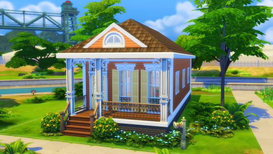
youtube
Cute Tangerine - Starter Home
17k..ish
1 Bed // 1 Bath
Perfect for a couple or a single sim.
No cc.
Gallery ID: Ophelia Nygmos
132 notes • Posted 2021-03-29 12:51:38 GMT
#3
For one night and one night only, Poppy and Reef have transformed into their former youthful selves.
This Date Night Collab by @joliebean ⭐@trillyke ⭐ @oakiyo is EVERYTHING! 😍😍😍 Seriously, everything is GORGEOUS!
162 notes • Posted 2021-02-27 16:27:22 GMT
#2


Smooth Pop!
~ A photoshop action! (not a psd).
So I originally made this action to edit my sims 3 pictures, which is why the blurry effect is so strong.
The pictures on the left are unedited, the pictures on the right are edited using the Smooth Pop!
Resizes to 1280 x 720*
Smooths our the surfaces.
Brightens up the image
Enhances colors**
It does not use Topaz Clean.
*This is the first step and can easily be deleted/altered.
**It especially enhances the color red, so I would not recommend it for the images where red is the dominant color.
DOWNLOAD: sfs // mediafire (no ads)
Bonus pics of Smooth Pop on top of my reshade preset Subtle Paradise underneath
219 notes • Posted 2021-04-08 17:34:48 GMT
#1

Townie Makeover Savefile
I have been receiving a few requests to release my townie makeovers as a savefile so people wanting to use them in a new save won’t have to place them all manually.
I’m happy to do that, but cannot stress enough that this is not a savefile in the classic sense - it’s just a shortcut to placing townies. I did not touch about 95% of the buildings. They are just as EA left them. (uninhabitable, ugly and useless 🤣)
Useful infomation:
All the townies are cc free.
All the townies can be found on the gallery under OpheliaNygmos
Link to the official townie makeover thread
I still need to do the makeovers for the Eco Lifestyle and Snow Escape sims.
Link to my youtube video discussing the makeovers.
Aging is off per default
Installation:
This is a save file and not a mod. The file is called Slot_00000400.save and goes in your saves folder. (Electronic Arts/The Sims 4/Saves).
Please back up your saves before installing it and make sure you don’t already have one with this number.
Download:
MediaFire // SimFileShare (no ads)
667 notes • Posted 2021-02-15 16:20:12 GMT
Get your Tumblr 2021 Year in Review →
25 notes
·
View notes
Photo

Hey guys! I got an ask wondering how I make my gifs and some people have asked me how I color my gifs, so here you go!
We’re going to be making this:

You’ll need:
VLC Media Player
Photoshop with working Import Video Frames to Layers function and timeline. I use Photoshop 2020, but any older versions with these functions will work!
A high-quality video (preferably 1080p)
Tutorial under the cut!
PART ONE: MAKING YOUR GIFS
You’re going to want to open up your video in VLC Media Player and open it to around a few seconds before your scene appears. If you’re giffing from a small YouTube video you can ignore this step, but for movies and TV, you’ll want to use VLC to extract the tiny part of it you want.
Pause it before your scene and click View >> Advanced Controls.
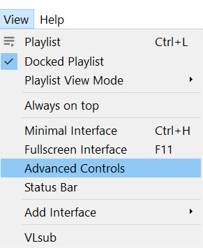
Above the play button, you should see a bunch of new controls. Focus on the red button I circled below:

Click this button and press play. VLC records are a little bit off, so this is why you want to be a few seconds before your scene actually starts so you catch it all! When your scene has played, press the button again. You’ve now recorded your scene and you can record as many scenes as you like for a full gifset.
You can find your recorded videos in the Videos folder. It’ll be named something like vlc-record-a bunch of letters and numbers.
Now that you have your scenes, it’s time to open Photoshop! When Photoshop has loaded, go to File >> Import >> Video Frames to Layers, which is a bit down to the bottom. It’ll prompt you to select a video; click on the video you just recorded, and a screen like this will pop up:
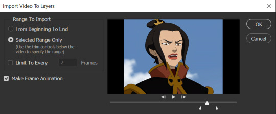
Use the white sliders to select the parameters of your scene. I would recommend going a little bit more on both sides so you catch your whole scene.
TIP: Make sure you do NOT select the button that says “Limit to Every 2 Frames,” because that will make your gifs look choppy and ugly. Love yourself!
Once your frames have loaded, you might not see them on Photoshop the way mine looks. If that’s the case, make sure you go to Window >> Timeline so you can see the frames!
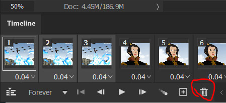
Delete the extra frames in your gif that you don’t need by selecting the frames you want to delete and pressing the trash can button, circled below:
Now that you’ve done that, it’s time to crop. For this particular gif, I’m going for a full-width one, so the width I chose is 540px and I chose a height of 290px. Click on the crop tool and make sure your crop settings are at W x H x Resolution, or you won’t be able to input specific dimensions the way I’ve done here:

Position the crop tool where you want your gif to be:
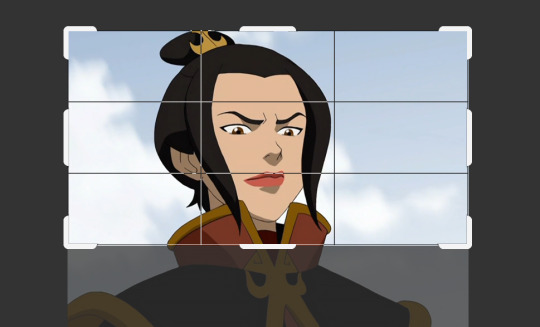
And now that your gif is all cropped and sized, it’s time to sharpen! I have a pretty specific sharpening process that I’ll outline in detail here, but I have an action for this purpose so as to save time. I’m just making this part of the tutorial so you know what you’re meant to do in Photoshop.
First, go ahead and click the three little bars at the right edge of the Timeline/Frames tab and hit Convert to Video Timeline.
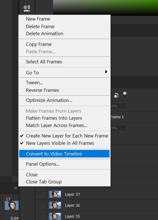
Now, your timeline should look like this:

Go to Select >> All Layers, and right-click on one of the layers in the Layers tab once they’ve all been selected. Select Convert to Smart Object. This allows us to sharpen the entire gif at once as opposed to by frame! Your timeline should now look like this, with all the little purple parts condensed into one:

It’s time to sharpen! Go to Filter >> Sharpen >> Smart Sharpen. I do two passes with the Sharpening tool; here are my settings for both:

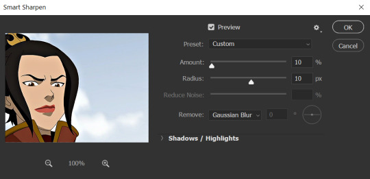
It’s not too apparent in the pictures, but it does make a difference. Don’t worry about your gifs looking too sharp; I use this action on every single one of my gifs and it always works like a charm.
Now that our gifs are nice and sharp, it’s time to take them back to frames. This is because of a glitch in Photoshop that makes gifs saved in Smart Object form much faster than they would be in frames. Click on the small bars on the right of the timeline again and select Convert Frames >> Flatten Frames into Clips.
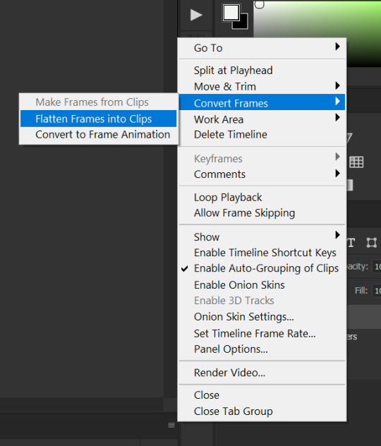
Your gif should have all those little clips that we had before we converted it into a Smart Object.
Then, go to Convert Frames >> Convert to Frame Animation.

Your gif should be back in frames again, but it’s all one frame. Don’t worry; we’re going to fix that by clicking Make Frames from Layers from the menu with the three little bars again.

Now all your frames should be back! We’re going to set the speed of the gif now. Hit those three little bars again and click Select All Frames. Now click on the little triangle under any frame and click Other, and a little popup will appear. I always set my gifs to a speed of 0.05.
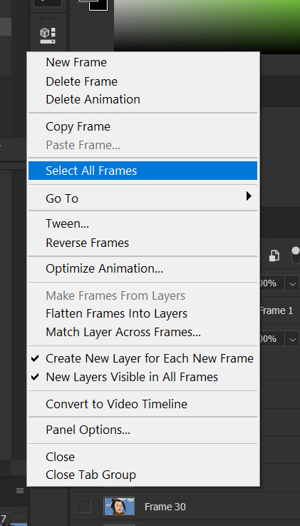

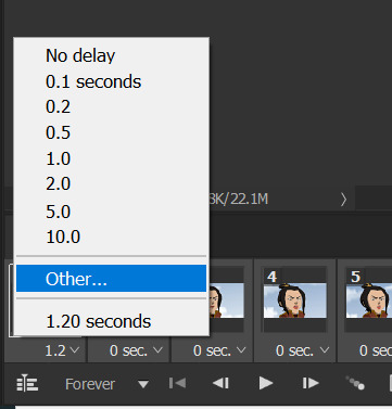

At this point, I save my gifs as a .PSD file. You can delete these PSDS after you’ve posted your gifset (I usually do to save space!), but it helps to have them so you can edit your gifs later if you want. Hit Ctrl+S, and now the screen to save it should pop up. Make sure you save it as a PSD file and not something else.

Now you have a gif that you can color! Which brings us to…
PART TWO: COLORING, ADDING SUBTITLES, AND SAVING YOUR GIFS
I do run a pale blog so this is going to be a pale coloring tutorial. You can check some popular resource blogs to see if they have any tutorials for colorful gifs!
I start out by making a group with the little folder below the layers tab; I title it “coloring.” (Not pictured: I added a layer mask and painted one black dot over it so I could reference the original!)

I always start out with a Curves layer; here are my settings:
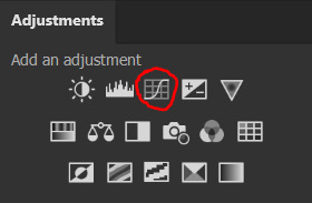
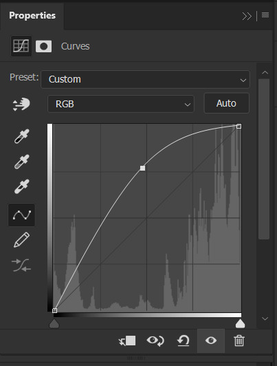
The gif at this point:
Next, I decrease saturation using the Hue/Saturation adjustment:

After this, I add a black and white Gradient Map layer and set it to blend mode Exclusion at 10% Opacity.


Then, (not pictured), I add a Selective Color layer and reduce blacks in Whites and Neutrals while increasing them in Blacks.
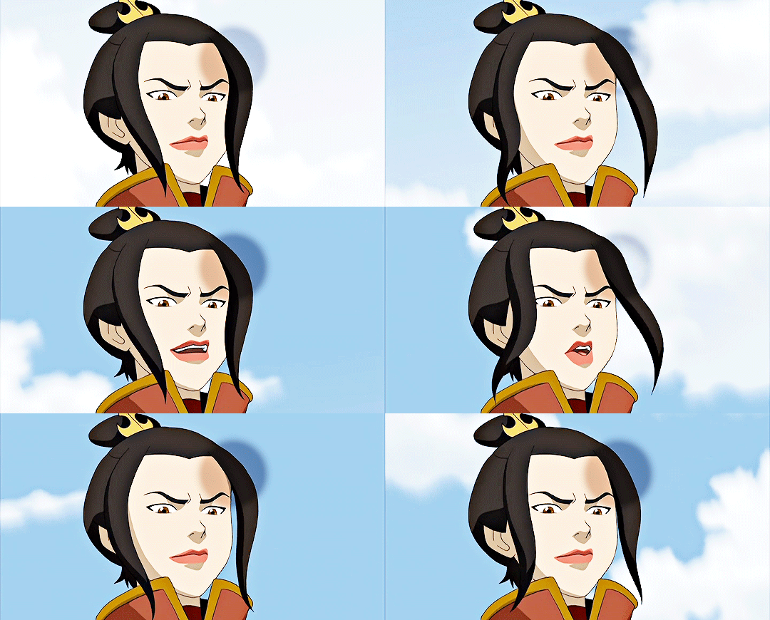
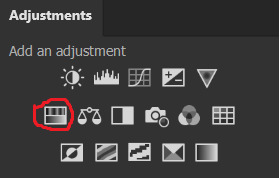
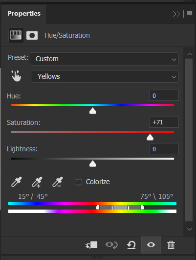
To make the background pale, I added a Hue/Sat layer, applying 100% Lightness to the Cyan and Blue channels and adding color to Azula’s skin by saturating the Yellows.

Here’s the gif after those adjustments:

Now I’m going to restore color to Azula’s skin following my own tutorial, so I’m not going to go into those details here. However, here’s the gif after all this. It’s not totally the same as Azula’s skin, but going any pinker makes the gif look awkward and oversaturated, which isn’t a good look:

After some minor adjustments and removal of the layer mask:

Now for subtitles!
Use the Text tool and make a rectangle at the bottom of your gif where subtitles go. I use Arial Rounded MT Bold, with Regular style, at 3.36pt and Sharp anti-aliasing.


Create a rectangle at the bottom of the gif where subtitles go and type in your text; then right-click on the text layer and select Blending Options and check Stroke, and these are my settings:

Now your subtitles are all ready! I’d recommend duplicating one frame of the gif and then duplicating the text layer onto a new canvas and saving it as a PSD so your settings and placement are always consistent across your gifsets!
Time to save your gif. Here are my settings, circled ones important:
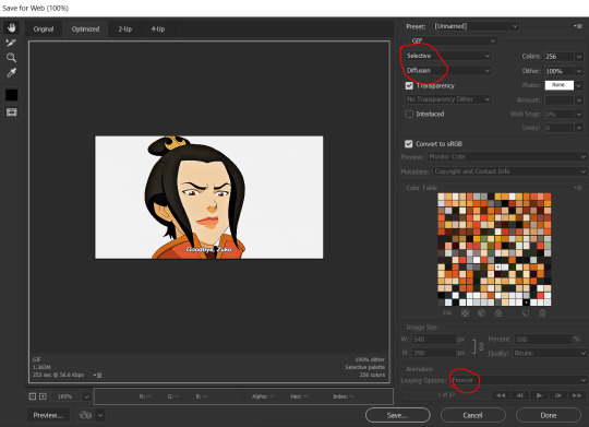
I’ve seen gifmakers use Adaptive+Pattern but I personally think that looks grainier and the pattern is really obvious; in my opinion Selective+Diffusion looks smoother, but it’s all up to you! Experiment with what you think looks best.
Make sure your gifs are set to loop Forever or they’ll only loop a limited amount.
Here’s your finished gif!

I hope this tutorial was helpful! Please reblog this if you learned something, and I hope you have a wonderful day. Happy gifmaking ❤
#allresources#chaoticresources#yeahps#biresources#resourcemarket#useradeela#usermaira#userdanisaur#userchelsea#tuserivy#*mine#resources#tutorial
412 notes
·
View notes
Note
hi ally! <3 I want to learn how to gif and there are so many amazing resources out here on tumblr, but I literally know nothing, I don't even know my way around photoshop.. so I guess all I'm asking is, how long did it take you to learn how to gif? 😮💨🥲btw all your gifs are so so beautiful ❣️also do you use any programs that you had to buy or can you rely almost completely on free programs (bc I don't want to immediately spend money)
hi anon! it's hard to say how long it takes to learn how to gif. it depends on how complicated your coloring is, like whether you do a simple color correction or if you want to make something more complicated. personally i still don't feel like i have completely learned it tbh but thank you for the compliment. as for the programs, the way i do it i use two, one for making screen caps (the one i use is free but super old and buggy and not even in english, so i won't recommend it to you, although i've been wanting to try this one since forever but i'm too lazy), and the other one for editing itself (photoshop). i have photoshop subscription that's 10$ a month but there are, uh, other ways to get it. just make sure there are no viruses if you use those other ways. and getting back to learning how to gif, honestly just start making them, even if they come out super ugly at first. that's the only way to learn. use high quality footage, 1080p or even 4k if your laptop can handle it. look up sharpening & coloring tutorials, or even use pre-made coloring psds & sharpening actions (there are plenty of them on tumblr resources blogs & they're completely free). just start and you'll get there, it's literally just a lot of patience & clicking at random shit in photoshop to see what's gonna happen.
#i hope this rambling makes any sense#it's just a bit hard to explain in several sentences#replies#ps asks
3 notes
·
View notes
Note
How did you get into gif making? Is it easy to self teach yourself, or did you have someone/something to teach you?
So I used to make gifs a long time ago when I first joined this hellsite Tumblr as a teenager, and they were probably much more barebones and ugly (not that I think they're nice now, but I like learning). I was really trying to teach myself photoshop and would just do a lot of tutorials -- with still images and gifs or even creating something from scratch.
Basically, I am applying the basics I remember, but also talking to folks and grabbing resources from around the internet. @allelitewrestlings has some beautiful PSDs that they shared out a while ago that I have used and other creators both in and out of the fandom have shared things like PSDs and actions for things like sharpening and even just best practices. And I have also been poking around Photoshop and just trying to teach myself new things and how to do various things.
Sometimes I also send up the Bat signal if I don't know something and some of our very talented gif makers in the AEW fandom will help me out (shout out to Kara!). Some of them also have answered questions about it in the past, so I search their blogs for that (Emi, Ash, and basically anyone else I've reblogged with “cowboy” or “hangman” or some version of “adam page” come to mind, I guess our handsome Cowboy Champion inspires a lot of beautiful visual work). So it's a mix of all of it. I am a hands on learner, so I learn by doing but seek help everywhere I can. This is probably not a helpful answer, but I don't really have just one way when it comes to gifs.
The best advice I saw from someone, and I forget who (if you couldn't tell I can't think of a lot of specifics or I'd link to posts right now that would be helpful) is to not even worry about things like coloring or sharpening, start with the basics and go from there and have fun.
2 notes
·
View notes
Note
4, 5, 22, and 30!
4. if you can remember, why did you start editing?
I started editing (as far as I can remember) because I wanted to keep up with the simblr community, I guess. I felt super insecure about my pictures, and thought they were super ugly. It started with using reshade for my gameplay/BC pictures on my old blog, and maybe throwing on a psd. Then, I started using actions, and eventually I learned how to draw shadows. But yeah, long story short, I wanted to have my stuff look halfway decent. (btw, there are plenty of people who can make pictures look good without heavy editing!! I just enjoy editing, for the most part.)
5. if you caption your edits, what do you decide to put in the caption?
When I first started editing, it was always song lyrics, because I thought that was Cool. Now I still sometimes put song lyrics in there (like in this edit), but more often I put something random, ig?? Like, for my edit with Nikolai (which I have a whole series of, btw), I made that quote up, inspired by the Shakespeare quote "Uneasy lies the head that wears the crown." And then there's the ones where I end the caption with ".png" I just think it's kinda funny, ig. Cause, like, it's literally a png. but I never name my edits that on my computer.
22. is there an edit you didn’t like when you made it but like now?
Uh... not really?? More often it's the opposite. Cause if I don't like an edit, I would just give up on it, or not post it, or something.
30. tell us a fun fact about an edit you’ve done
Okay, so I'm gonna expose myself right now, but my edit with Nikolai (the sim) was vaguely inspired by me daydreaming/thinking about Leigh Bardugo's books, and her Nikolai. The sim Nikolai was inspired by my mental image of Nikolai Lantsov, but the edit (and the rest of the panels I haven't posted yet...) really don't have anything to do with him or the Grishaverse in any way.
Thanks for asking, Leo!!
#ask game#ask Morrigan#thanks for the ask!#noncommittaltrait#<3#btw everyone go give LJ a follow#they're one of the best people I've met on this site
3 notes
·
View notes
Note
hey, i love your gifs, they are really gorgeous. I'd like to start making gifs maybe you have some advice or recommend some tutorials on how to achieve high quality in gifs or about coloring?. I'm sorry if I'm bothering you.
hi and thank you very much 💕
mmh my advice...
- use only HD videos (1080p upwards), i sometimes use LQ ones (if there's nothing else available) but only for very small gifs
- start with a simple colouring so you get the hang of ps: brightness/contrast, curves, colour balance and selective colours. there's no need to know every ps function at the beginning
- when you take caps (if you take caps, that is), use them all!! do not skip frames! gifs will look jumpy otherwise and really not pretty
- sometimes you just have to accept that a scene is ugly and you can't colour it the way you want it so go simple(r)
- if you don't know how to start colouring a scene, start with a curves layer set on auto and see where it takes you. it usually solves tones/brightness problems (if not, just delete it- i sometimes delete it and start from scratch if it makes the gif uglier)
- highlight the colour accents! if there's some magenta/cyan/green in the scene, set them off with a selective colour's level because sometimes reds and yellows cover everything
- about the last bullet point, use masks to make the level visible just on a certain part of the scene
- sharpen your gifs! i myself don't know how to do it (prettily) so i download actions made by more talented people: here you can find some good ones
this is exactly how i make my gifs (though i have ps cc)
i also recommend this tutorials page because it literally answers every question you may have
about colouring psds: i used to download some of them and "dissect" them to understand better how to achieve a certain colouring (ie. i put them on a gif and start playing with the different levels)
i don't know if this is what you wanted, sorry D:
#wonderfulingg#ask post#please click on the tutorials page link it's really really well done and i bet those people are better at explaining things than me lmao
13 notes
·
View notes
Text
» 𝐆𝐈𝐅 𝐈𝐂𝐎𝐍𝐒 𝐓𝐔𝐓𝐎𝐑𝐈𝐀𝐋 𝐁𝐘 𝐑𝐄𝐏𝐋𝐀𝐘𝐆𝐈𝐅𝐒 !


hi folks! i’ve gotten a few messages on how i make my gifs, on what tutorials i used, etc. so i decided to make my own (since i didn’t use one) in hopes of helping a few people get their footing on how to make gif icons from scratch! this tutorial has been made with the assumption that you have prior knowledge of using photoshop (e.g. like smart filters), but please don’t be afraid to ask me any questions if you need anything explained or you’re a lil confused. however, do bare in mind that i am no photoshop genius, and have never become more advanced than what i required for my needs. anyways, without further ado, the tutorial on how you can make something like the above can be found below the cut. please like or reblog if you found this useful in any way!
some starting tips:
gif icon making, or gif making in general can be strenuous. do not give up if it doesn’t look like you want it to the first time! it’ll take time to find what you like.
don’t compare your gif icons to other’s, which i’m guilty of, but your gif icons are unique and lovely in their own way and you should view them as such!
♡
i am using a macbook, with a mac operating system and adobe photoshop 2020. keep in mind that this is the way i make my own gif icons, and i’m just sharing what i know so this may not be the best/easiest way to go about things, like you can probably include scripts that save it for you, etc. but i prefer having more control over to process.
♡
screenshots will be distorted, for easier viewing i’ve added a link that will take you to the full size image.
♡
before anything, a high quality gif comes from a high quality video. when downloading your content, make sure it's either 720p or 1080p resolution.
♡
step 1: open up your .mp4 file
open it up as if you are opening any other file on photoshop. no need to import video frames to layers or anything of the sort. i find that way better for making gifs for gif sets instead of like 100+ gif icons. your photoshop should look like the image below.
this works best with shorter video files of around 1-3 minutes.
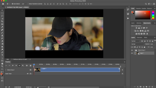
step 2: find your faceclaim
your video should now be open in photoshop as a video timeline, keep this the way it is, you’ll be able to move along the video to the next gif. using the timeline layers (see:layer 1), you can slide along until you find your faceclaim.
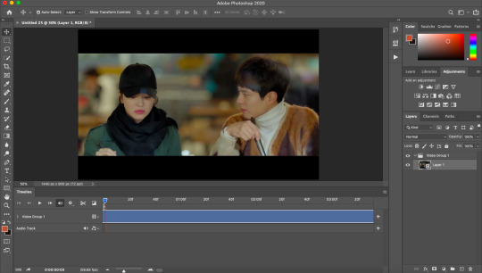
*extra info for those that don’t know. to extend your layer and make it easier to find your faceclaim, you can use the slider down below which looks like this:

this will essentially space the frames out more, if that makes sense?
step 3: select your gif focus and crop
use the rectangular marquee tool (circled in red) and select the area of your gif icon.
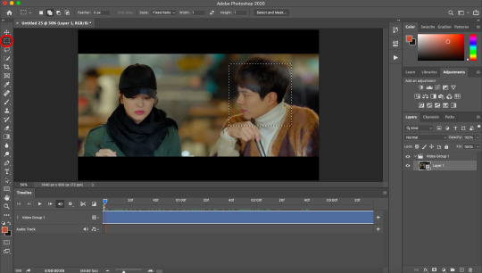
following this, use the crop tool (again, circled in red) to cut out the rest of the area. you are now left with a square.
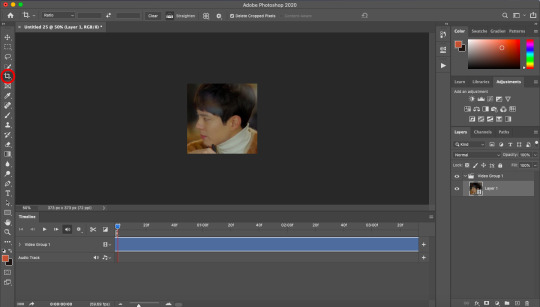
step 4: select the length/frames of your gif
this step can be done pretty much anywhere between step 2 and step 7, depending on your preference. anyway, use the slider (red arrow pointing to it) to decide where you want your gif to end.

then, bring the end of your video timeline (red arrow pointing to it) to where your animation slider is. your video timeline should now look something like this:

the space in between the lil sliders will only includes what will be in your gif.
step 5: resize
using image size, resize your gif to whatever size you wish. i prefer 80px.
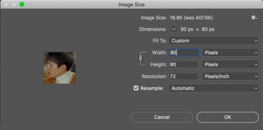
following this, it should say that your file is going to be converted into a smart object, click okay. (i can’t show the pop up since i got rid of it).
yet, now that you’re looking at your gif icon, you’ve realised you don’t really like the placement of it. simply cmd/ctrl+t to go to free transform. i moved it a tiny lil bit to the left.
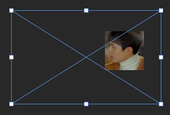
as you can see, the rest of the video area is still there. you can now transform it to your liking. this will be useful when you want to change the area again.
step 5: add sharpen settings
you now have an icon, you can sharpen it to your liking.
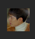
i use smart sharpen and gaussian blur. i tend to have them in this order.
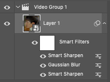
you can change the opacity of each smart filter to your liking. i won’t be sharing my exact sharpen settings (not that they’re hard to figure out), as i’d like them to stay unique to me, but do play around with this and see what you like the most (the key is less is more).
the trick here is to include the sharpen>blur>sharpen filters, which will give a sharpened appearance without overdoing it, and make your gif icon a lil smoother as well due to the blur.
**also, you may see the lil video group 1 in my layers there (and in your own too), this isn’t really necessary and is more of a pain in the ass that anything. if you have this, you can get rid of it by right clicking on it and ungrouping layers.
step 6: add your colouring
my colouring is a mixture of psds i’ve interchanged for years and i have lost the originals so do not intend on sharing. do look around at psds or make your own colourings that suit your tastes.
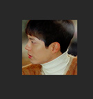
BE MINDFUL OF WHITEWASHING!!! if you are giffing people of colour, use colourings that do not make them into a white sheet or a gray mess. i see this constantly as if it isn’t 2020.
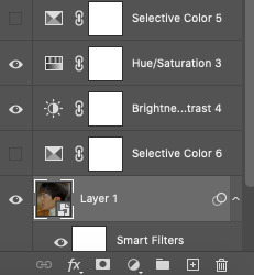
adjust! adjust! adjust! your colouring will not always work on different people or different scenes. adjust your levels, saturation, selective colour, brightness, etc to make sure the colouring works for your previous gif, as well as your next one.
even you can see here that my layers are mess because i adjust constantly.
step 7: save for web
now that you’ve made your icon all pretty, save it for web and it should look like this:

step 8 (optional): speed
if you like your gif icons slower, you now have to upload the gif file into photoshop again. this will take you to the frame timeline. you can change the speed of your gif to whatever you want, and save again.
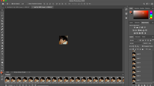
and there you have it, your is gif icon complete.

step 9: making more!
instead of going through this whole cropping process again, you can continue to move along the video timeline to different frames of your faceclaim, and making the next gif with just the exact sharpening settings, colouring, etc. this will make it super easy to make more gif icons in less time.
this can be done by simplying moving your animation timeline.
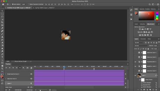
again you can use cmd/ctrl+t to adjust your gif placement. of course, this doesn’t always work, and you may need to revert back to your original video to crop the area again. an example of this is if you need a bigger or smaller area for the gif.
i just made this gif in a few seconds.

action
i use my own script to crop and have included the rest all in one action file. i did a lil digging and found this gif icon making action (resizes to 80px) that does essentially the same thing with no script. this will make it already 10x easier to make an icon. you can then make your sharpening into an action and you’ll basically have most of the job done for you in one click.
tips:
make things into actions! for example, i cut down a lil on the speed changing process by making actions that change the speed for me.
save your actions! you never know when you’ll lose them
you might get tired of looking at your gif icons after a while, they might even start to look ugly but that’s most likely because you’ve been looking at them for too long, so don’t feel discouraged!
crop close to the face, this is important! what in the fresh hell am i supposed to be seeing in a 70px gif icon if its so far away, or in general tbh
anddd that's about it! i hope you find this useful! again, if there are any questions, feel free to im me or send in a message and i'll do my best to help!
#rph#rpc#gif icons#gif icons tutorial#gif icon tutorial#i hope this is explained well im ...#i tried to be as thorough as possible to like make sure it all comes together
218 notes
·
View notes
Photo
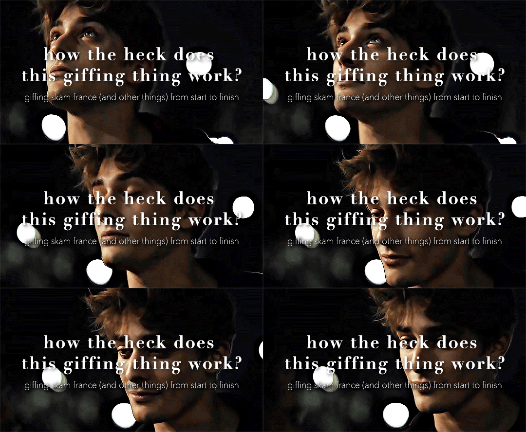
so here’s my disclaimer: I hardly know what I'm doing. This is my glued together homemade giffing method that I’ve created over months of just random experimentation and bits and pieces from all kinds of tutorials. there are probably better or more correct ways to do a lot of these things! this also isn’t a completely universal tutorial, some of the specifics are geared towards giffing skam, specifically skam france.
I gif in photoshop cc 2020 on a macbook. Some things like keyboard shortcuts and little things about the photoshop interface will probably vary if you are on a pc/ other version of photoshop!
this is very long and very unprofessional, but I hope there is something in here that someone will find helpful!
we’ll be going from this:
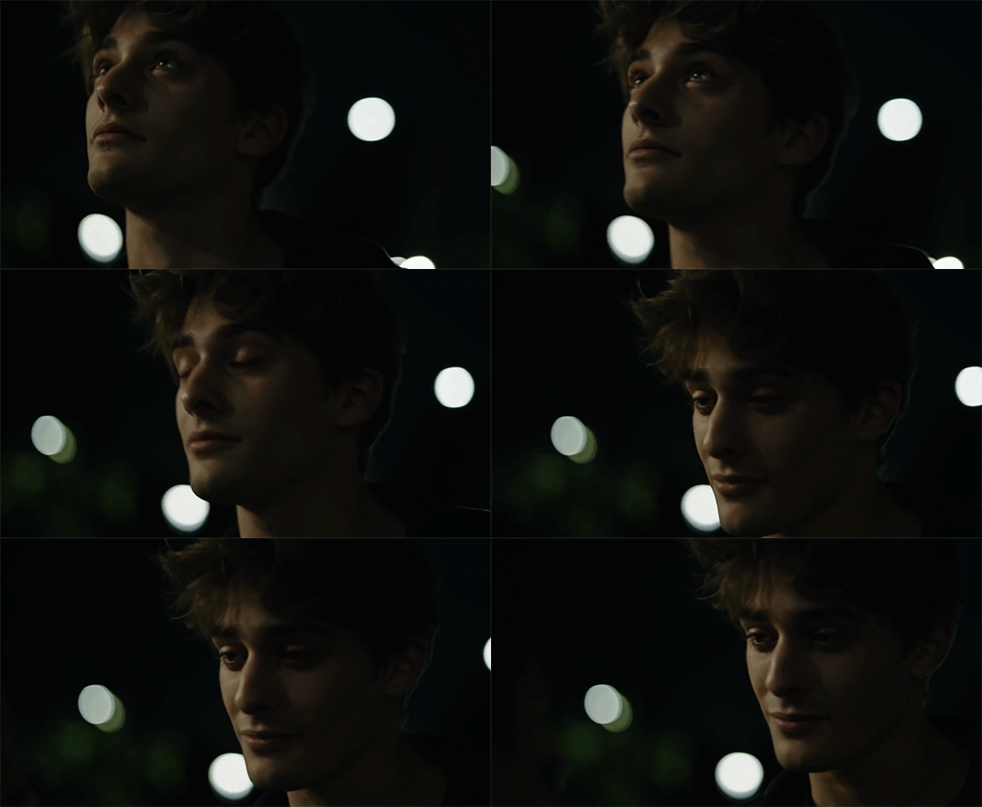
to this:

up to date as of October 25, 2020
downloading clips
selecting what part you’re going to gif
cropping
my action for resizing, converting to a smart object, and sharpening
coloring
exporting and setting the delay
tldr tips
1. downloading clips
4k video downloader (which you can get for mac or pc here) is great for things posted to youtube, especially from skam france because all the clips are on their youtube with no weird geoblocks or anything! it’s really easy, you just have to open the clip in youtube, copy the link, and go into the program and hit paste link. I like to put on smart mode first and set the destination folder so all my clips go into the place I want.
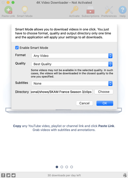
There is a 30 video per day download limit, so if you’re thinking you really want to gif lots of stuff from the show, and want a big chunk or a full season it’s definitely worth hunting for a mega or google drive with full episodes to download because it’s just less hassle! I might come back to this post later and compile a list of all of those, but for now if you type “[remake] no subs google drive” or “[remake] no subs mega” into a google search, you’ll probably find something! the all of skam website has no subs for several remakes, but not all!
If you don’t have enough space on your computer to be keeping full seasons, I know there are methods to get screencaps without having to download (generally for giffing movies and regular tv I think this is a common method), but I’ve never done it so I’ll redirect you to this tutorial that explains it! you should probably just go there for the whole thing tbh it’s much more coherent than this, but I digress.
2. selecting the piece of the video you want to gif
now that you’ve got your episode or clip you’ll want to just open it in photoshop! if you go the screen capping route the way to do that is a bit wonky, so you can keep following the tutorial I linked above and join back in here at coloring if you like!
if the timeline at the bottom doesn’t pop up automatically you can go to window > timeline and turn it on! now you can use the scrubber bar thing to find the moment you want to gif!
The advantage of this over screen capping is you can scrub with more precision. the arrows circled in blue below let you jump only one frame, where in screen capping I'm pretty sure you can only go by ten second or one minute intervals.
I usually drag the scrubber as close as I can to the start of the shot/moment I want to use, fiddle with the arrows circled in blue below to jump forward or back one frame at a time until I'm at the first frame I want. I move the left grey handle to the scrubber and then I hit the play button and let the whole shot/moment play. Pause and repeat the shuffling with the arrows until you’ve landed on the last frame you want to use and move the other grey handle.
the moment you want to use should be between your handles (it’ll look like what I have circled in red), and if you hit play, you should see the thing you want to gif playing on loop above the timeline. the speed will probably be weird, but we’ll deal with that at the end.

now I recommend doing command or control + s to save your gif as a psd (photoshop document). this is a working, editable file which means if photoshop crashes you can open your file right back up and keep working as long as you’re hitting command or control + s at regular intervals as you work. later we’ll go through exporting in gif format that can actually be uploaded to tumblr.
3. cropping
next I crop out any logos or black space at the top and bottom. Just click on the crop tool on the lefthand side of the screen, drag the edges and hit enter when you’re done. you can of course crop out more than just that, but regardless of what you crop out, now is the time to do it.
you can set an aspect ratio for your crop at the top of the screen if you’d like to be positive that all the gifs in your set will be the same:

4. my trusty action: resizing, converting to a smart object, and sharpening with one click
Now is when I use an action I made that does all the resizing, converts to a smart object, and sharpens. I’ll take you through the steps so you can conceptually get what’s going on, but I highly recommend using the actions window to record your process as you follow along so you have this action as well. It easily shaves at least 5-10 minutes off of the whole process, and these steps will be the same every time.
here’s how you make an action: go to window > action and open the action panel. click the plus symbol to start recording a new action:
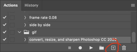
in the window that pops up, give it a name and hit record:

now just continue with the steps below, and it will save them!
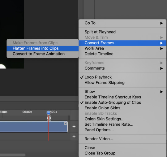
first you flatten frames to clips (I think it says flatten to layers on older versions of photoshop). this is in the menu at the top right corner of your timeline:
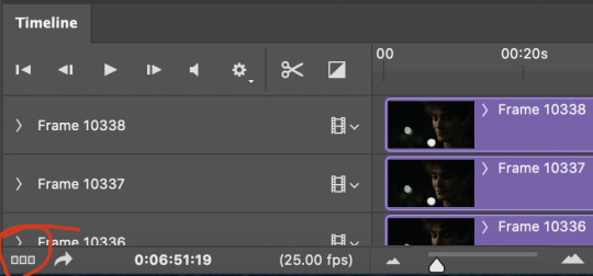
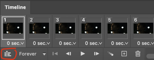
next you convert to frame animation by clicking on the symbol in the bottom left, circled in red:
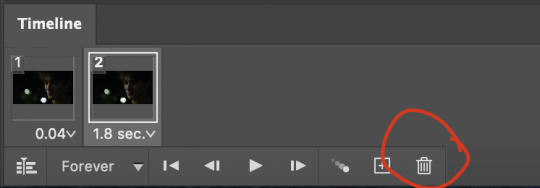
if there is more than one thing in the frame animation, delete the extra one. you don’t need to keep the last one but it won’t let you remove it until there are other frames in there. also go into your layers and delete video group 1 and its contents. don’t ask me why these steps are necessary, I don’t really know, but I’ve noticed it sometimes gets wonky if you don’t do this:

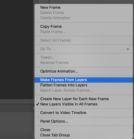
now you want to make frames from layers and delete that first frame that was there before:
then we return to the timeline:
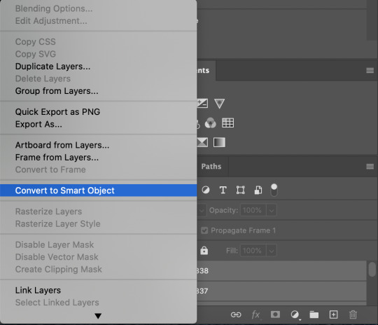
use command + option + a (control + alt + a for pc I'm pretty sure) to select all layers and then right click within your layers window and select convert to smart object. It’s important to convert to smart object after you go back to the timeline, or the gif won’t move:
next I resize. gifs for tumblr should be 540 pixels wide. for recording your action you should just go into image > image size and only change the width to 540 in case you ever have gifs cropped to different aspect ratios. don’t touch the height, let constrain proportions figure it out!

now, here’s what our base gif looks like, no sharpening, no coloring:

now to sharpen. go to filter > sharpen > smart sharpen. this is up to personal preference, but my go to settings are:
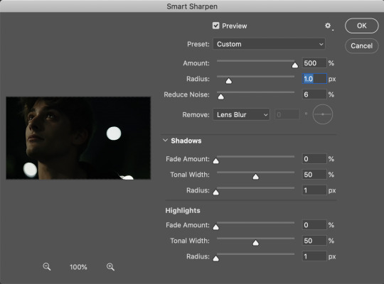
this is what we have after sharpening:

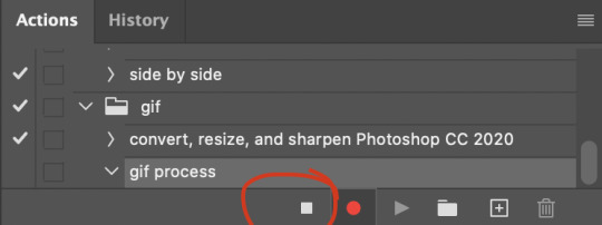
now is when you can stop recording your action.
just press the stop button in the action window:
this action is pretty much universal and after I select the moment the gif will be and crop however I want, I use it on every gif I make! so although this initial setup is tedious, now you’ll never have to do these steps again, and the process is magically much quicker.
5. it’s time to jump into coloring!
I typically start with exposure and sometimes some brightness/contrast. with really dark gifs like this, you kind of have to make it worse before you make it better. I did this:
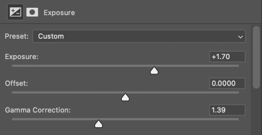
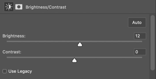
now the gif looks like this:
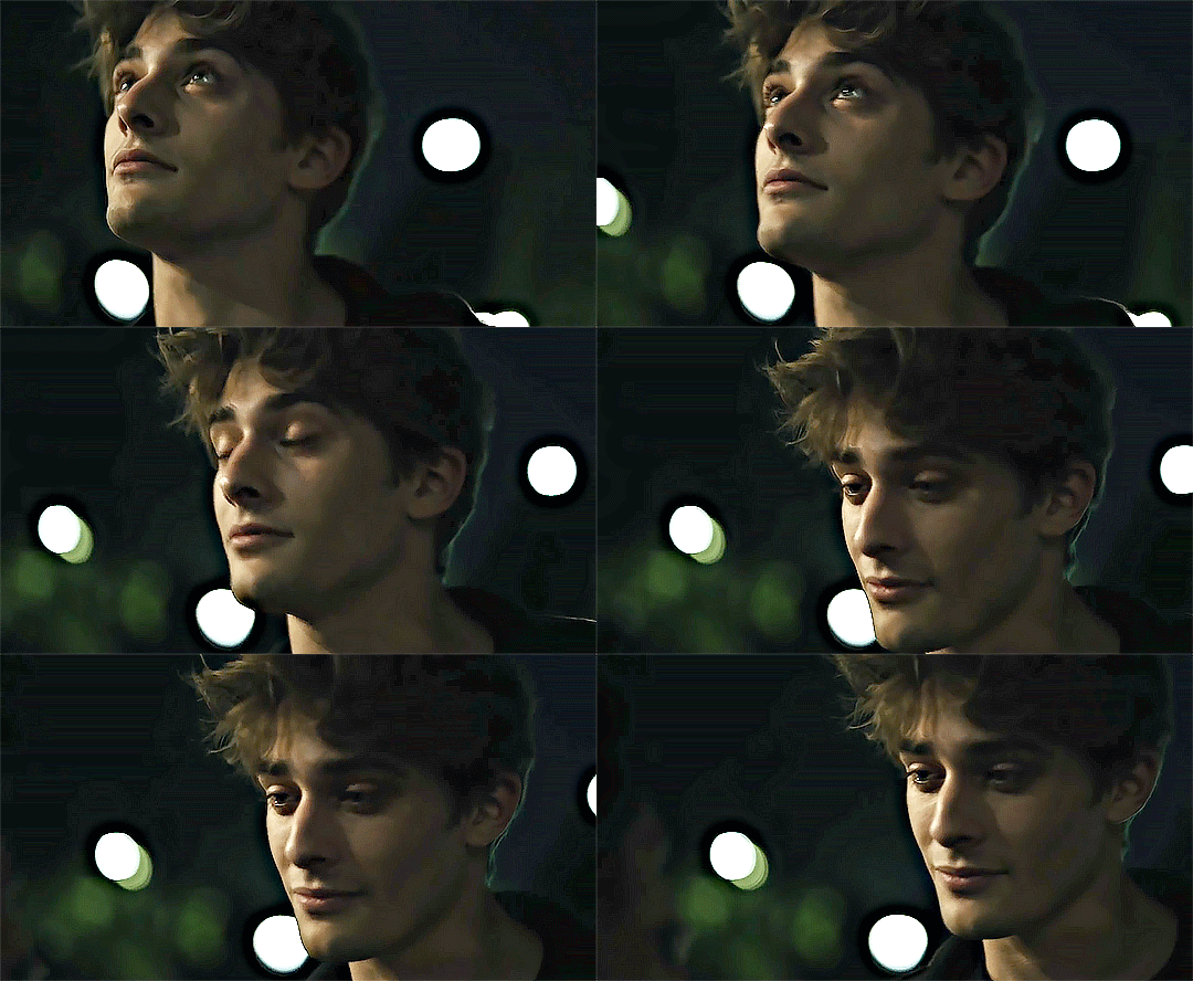
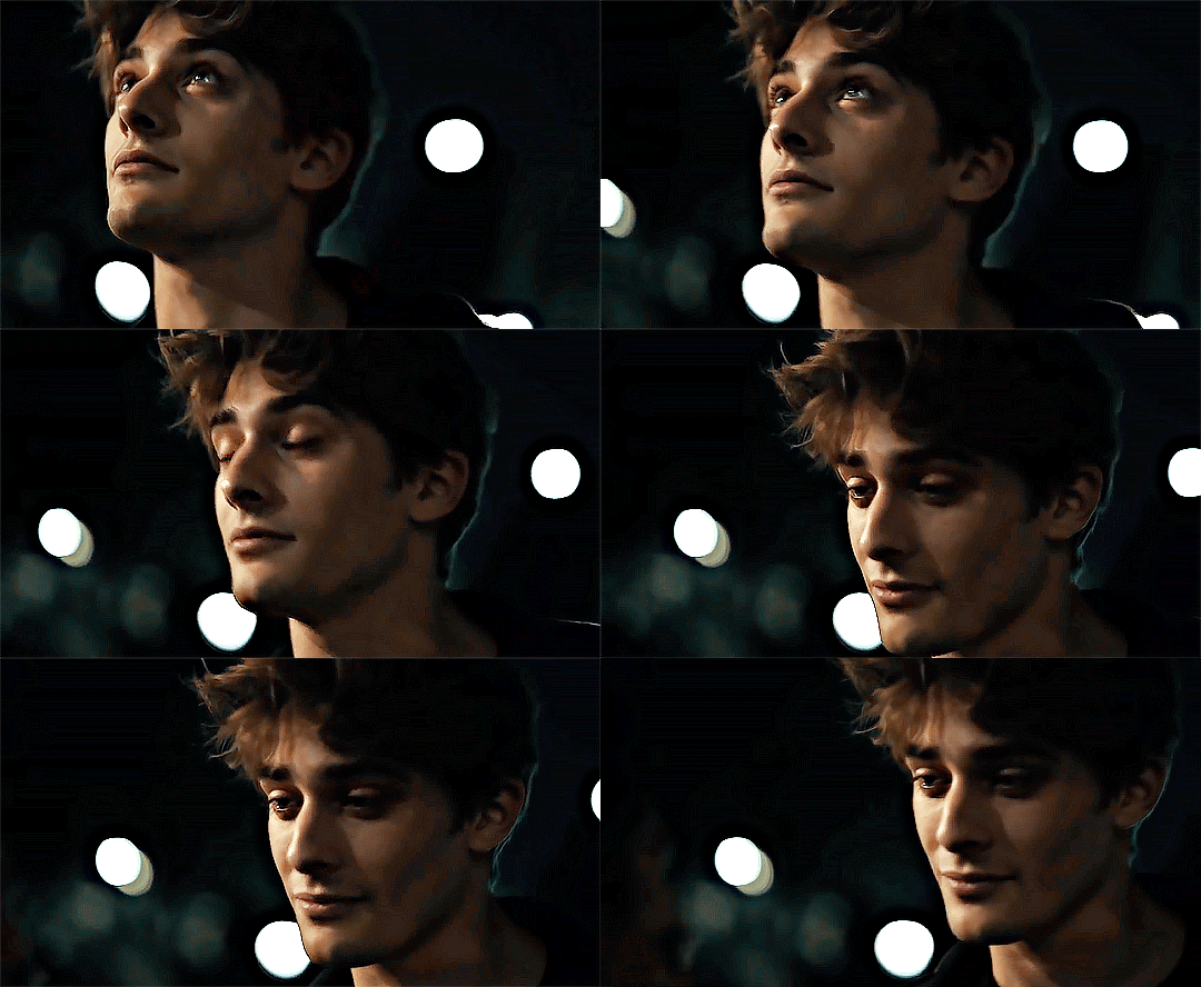
we have some static and some ugly bits, and this is where selective color comes in to fix it! boost blacks like this:
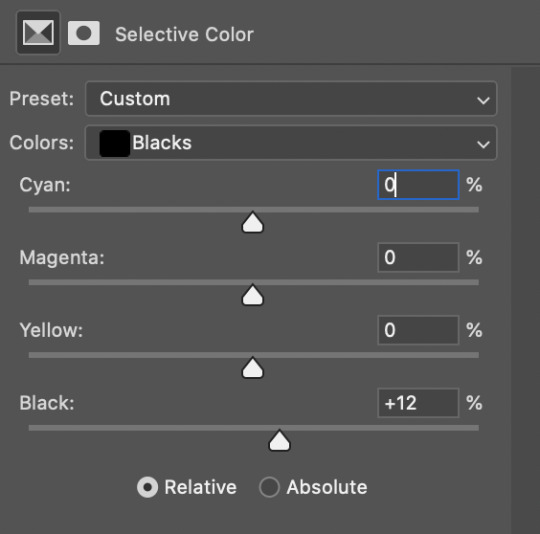
and now your gif looks like this:

the skin tone is looking a little sickly and weird, so I go into the yellows and reds in my selective color layer to fix it! I also messed with the greens here because I didn't want color in the background (that part is totally optional and just up to your preference):

now we have this:
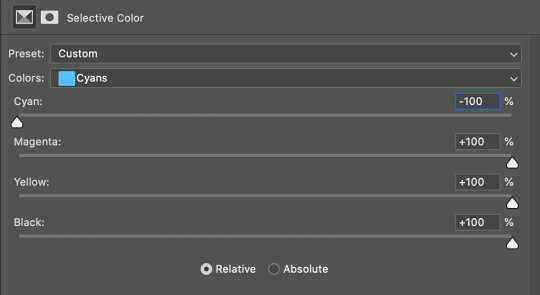
to really take the color 100% out of the background, I did one more separate selective color layer for cyan (again, I just felt like it but this is optional!):
and now the finished gif:

there’s lots of fun extra things you can add like text and tints and overlays and all that I won’t get into, but feel free to reach out for help on those types of things!
this gif was certainly not the most complicated to color. some ridonkulously dark clips (*cough cough* vendredi 20h27 *cough cough*) take tons and tons more effort than this and a lot of the time you’ll want to use color balance layers and vibrance layers and all of that to mess with your coloring.
with all of this coloring business, I really just learned by doing. I don’t know all the technical purposes of each type of adjustment layer, and I tend to stay away from curves just because I find them confusing and annoying. The bottom line is that you should always experiment and find out whatever coloring works for you and run with it! I’m sure every gif maker you talk to does things at least a little differently!
I highly recommend taking the time to go through all the types of adjustment layers and just move the sliders around to see what they do! That’s honestly one of the best ways to learn and decide what you like!
6. now to export and adjust the delay!
the keyboard shortcut for exporting on mac is command + option + shift + s, control + alt + shift + s for pc, otherwise you can go to file > export > save for web
my settings are here:
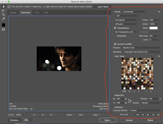
the settings only need to be configured once! otherwise just hit save and follow the pop ups to choose where to save and what name you want to give your gif. Since you saved as a psd way back, that will be the name it’s automatically given, but call it whatever you want!
then I adjust my delay by opening the gif I just exported (not the psd, the .gif file) and using one of my delay actions. I’ve made an action for each delay between 0.05 (real time) and 0.08 (really slow mo for certain super short shots, typically for more ~artsy~ sets).
all my action does is select all frames:
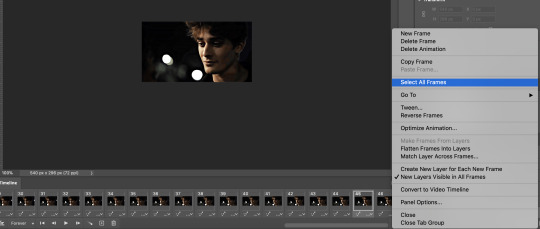
adjust the delay (which will differ based on whether you want them slowed down and by how much):

for reference, this is a 0.05 delay:

and this is a 0.08 delay
now you just export the same way you did before!
remember if you’re recording this as an action, you don’t want to touch the file name, just say yes when it asks if you want to replace the file. if you always save your gifs to the same place, your action will now enable you to override any gif with the incorrect delay with the correct one with one click!
7. tldr: the main tips
for downloading 4k video downloader works well for non geoblocked youtube videos, the all of skam website is another place you can look to download with no subs, here’s the screen capping method if you don’t want to download
The main way I combat dark lighting is to bump exposure to the right, gamma correction to the left, and then enhance black in a selective color layer. The amount of these three adjustments will vary gif to gif. I know lots of people use curves, but I find them really confusing for some reason, so this is my method! As my graphics teacher likes to say: there are always at least 3 different ways to reach the same result!
there’s a little bit of additional coloring on this one, but here’s another before and after example so you can get an idea of how those steps get you a better lit result without making the lighter parts super over exposed:

besides those three steps, you have free rein to use the other selective color channels, as well as color balance, vibrance, hue/saturation, etc. to restore color that was lost or to change the colors altogether! mess around with it and have fun experimenting!
7a. bonus coloring tip:
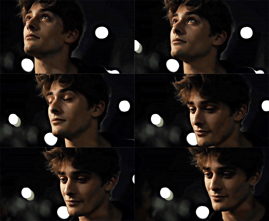
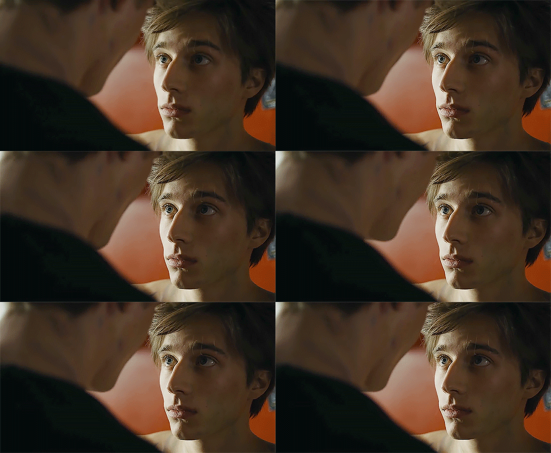
sometimes you can make use of selective color to completely alter an isolated color in your gif. You can get very adventurous with this, but here's a simple example of changing blue tones to teal (I got away with these gifs being longer because they were in rows of two in the set I posted them in. I'm too lazy to trim frames so I can put them here at 540 px without going over the 10mb limit so just ignore the quality ok):
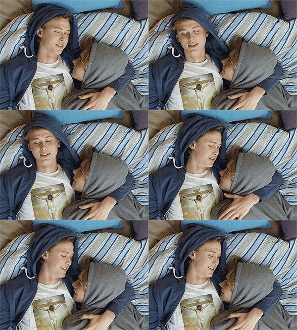
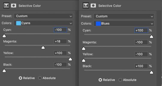
7b. actions, actions, actions!
if you find yourself doing a certain thing over and over, always record it as an action. the amount of time they will save you is honestly really impressive.
You can duplicate actions, so, for example, if you have different sharpening preferences for different shows or scenes, you can duplicate your gif process action and go into the steps, double click smart sharpen, and alter it however you want!
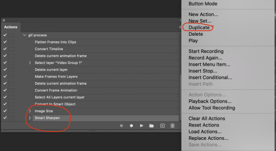
This could also be good to do for the different widths for tumblr if you ever do sets with rows of two or three! Duplicate actions is also how I made my actions that set delay at 0.05, 0.06, 0.07, and 0.08!
when in doubt, always make an action! it’s worth minimizing the tedious bits of the process as much as possible so you can focus on the fun part of seeing your awesome gifs come to life! any little task you find yourself doing often, make an action!
and for now that’s all I have. if any of this made no sense, if you want to suggest a correction or addition I could make, if you’re ever curious how I did something on any gifs I post, or if you have any other sort of questions, feel free to send me an ask or a dm! if I can’t answer your questions I’ll be happy to try to direct you to someone who can or a tutorial to help! again, I'm no expert, not even close, but I hope at least one person will find one thing in this mess that helps.
#this got . so long omg#mystuff#mytutorial#gif tutorial#tutorial#resources#fellow gif making peeps feel free to correct me or give input on how to improve or add to this tutorial!
31 notes
·
View notes
Photo
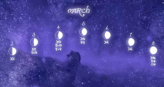
Celestial Forecast
Week 2-8
Sike! I am still going!! Take that PSD !
The aspects this week are really forcing us to look into our hearts. There is a handful of aspects being triggered by Venus and Uranus that will ask us to heal and bring positive change (along with some lunar transits triggering Ceres that will look at where we need to be nurtured) and this last leg of Mercury's retrograde leading up to the full moon at the end of the week will bring us to find out what we need to love and forgive in ourselves before we can absorb the retrograde lesson and move on.
Notes: this is london based so weeks are from Monday-Sunday and the time is set to UTC.
2nd
🌓 First Quarter Moon in Gemini ☽ Moon in Gemini trines Ceres in Aquarius ☽ Moon in Gemini Sextiles Chiron in Aries ☽ Moon in Gemini will Square Eros, the Sun and Neptune in Pisces
Energy: Today will feel vulnerable yet healing. With the moon waxing in Gemini it's a great day to open your mind and take in new information yet with mercury, the ruler of learning and the mind currently asleep this energy will feel inverted at best and could be used to learn about yourself and hidden emotional baggage that you may be clinging onto. With the moon making a harmonious sextile to Chiron and a powerful trine to Ceres, our deep wounds (and other wounds) will float to the surface yet we will have the opportunity to nurture ourselves and work through it. With Ceres in Aquarius the key will be to nurture ourselves by honoring our individuality and forgiving ourselves as well as accepting our uniqueness. With the square the moon will be consecutively forming with Eros, the Sun and Neptune throughout the day, these bruised points could potentially manifest in areas of sexual frustration, repressed anger or deceptions revealed. Especially with the sun square, these negative traits could be brought to light. It's a good day to do shadow work (I know I say that often but it's the retrograde along with these transits man..) and protect yourself from other's negative energy. Alternatively if you have had a foe that's been bothering you and pestering you for ages but unable to make others see that they are a gremlin all along, this is a good day to do a truth-revealed spell to expose their ass to everyone. The retrograde and these transits are about revealing secrets and ugly truths/emotions so if they are trying to be shady to you behind the scenes then you can expose the shade.
Recommendations: self healing, meditation, shadow work, tarot reading, divination, truth revealed spell, self love magic
_______
3rd
Venus in Aries squares Saturn in Capricorn
☽ Moon in Gemini trines Juno rx Libra ☽ Moon in Gemini sextiles Venus in Aries ☽ VOC 2:19PM-4:25PM (until next day)
Energy: Today will feel extra fucking tender as Venus will make an uncomfortable square with Saturn in Capricorn which will make us feel a bit lonely and in need of a hug. Though this energy might manifest in people feeling isolated the tension of this aspect may push others to want to build a long lasting relationship with loved ones whether that may be friendship, romance or any other meaningful bond. To add to this the lovely emotional moon's transits will make a trine with Juno retrograding in Libra (classic) and a sextile with Venus in Aries. These two aspects will make it a little easier to reach out to others to let them know you would like a little bit of love and support today and most likely someone you care about may reach out to you first. It's easy with these transits to want to isolate yourself especially with mercury's retrograde but if you do practice some self love magic and working on your heart energy. Do not do any love attraction magic if you feel compelled to. The moon will be void of course for most of the evening so it's a time to rest and reflect. Instead take care of yourself or reach out to loved ones.
Recommendations: self love magic, preparing drinks with intention such as hot chocolate, hawthorn tea, matcha tea (these are all heart-opening), self-love bath magic, napping it off (why not?)
_______
4th
Mercury Retrograde Re-enters Aquarius Mercury in Aquarius sextiles Venus in Aries
☽ Moon enters Cancer (4:25PM) ☽ Moon trines Eros in Pisces ☽ Moon sextiles Uranus in Taurus ☽ Moon opposite Saturn and Pluto in Capricorn ☽ Moon squares Chiron in Aries
Energy:
Mercury will re-enter Aquarius today. Aquarius tends to be more detached from the emotional details and can see the bigger picture which this phase of the retrograde may ask you to do. This segment you may find the tides of the universe are seeking for you to rise above your individual problems to see the grander scale and change your perspective. This re-entry will make mercury sextile Venus in Aries which will make you re-evalue the harmony within your relationships and how you express love and affection. This may be an awkward day to try to charm someone or express affection depending on how the retrograde may affect you (unless you are 100% honest and unfiltered about your feelings but even that could backfire).
With the moon in the most EMOTIONAL sign, (cancer), the lunar transits will add another perspective to our emotions as we may evaluate our relationships. It will trine Eros making our passions and desires clear (though we may lack the fire to act on them), it will square chiron making our previous traumas bubble to the surface and it will be opposite Saturn and Pluto in Capricorn which will only add additional feelings of loneliness, isolation, unearthed intense repressed emotions from the netherrealms of our deepest subconsciousness and a possible spike in PSD (pisces seasonal depression). On a positive note, the moon will also sextile Uranus in Taurus starting off this chapter of mercury's re-entry into Aquarius with some positive surprises or chance encounters that could help shake things up in a good way. This sextile helps break patterns and starts something new so this energy could be used wisely to evaluate what is no longer serving you mentally or emotionally and starting off on a positive foot!
Recommendations: journaling, resting, divination for shadow work, healthily crying
_______
5th
Venus enters Taurus ☽ Moon in Cancer trines Sun and Neptune in Pisces ☽ Moon sextiles Sedna in Taurus ☽ Moon opposite Mars and Jupiter in Capricorn
Energy: Today will feel like an oasis in the many days of romantic strife. The transits have not been kind to our hearts with Juno in retrograde, and Venus in Aries ridiculous aspects, but now Venus is taking a chill pill and returning to one of it's home signs Taurus. There's a reason why Taurus Season starts on 4/20 because it's the most sensual, relaxed, chill, luxurious, lush sign there is and we will feel the effects of Venus in Taurus with wanting to just enjoy life and appreciate the good things in it a little bit more.
Additionally the lunar transits are pretty nice too. The moon in cancer will trine the Sun and Neptune in Pisces making the day extra dreamy and creative and easy going. The moon will eventually make a sextile with Sedna in Taurus adding to our desires to be creative and in some cases may manifest in appreciating life and nature. The moon will also form an opposition with Mars and Jupiter in Capricorn which could either manifest a drive to put our feelings into action or expand on them or if we choose to not use the energy it could manifest in other ways such as sudden bursts of energy which could be either good or bad. With oppositions it's best to try to make the opposite energies harmonize otherwise the imbalance can cause unexpected bursts in areas we weren't ready to handle.
Recommendations: creating art, art magic, dance magic, kitchen witchery, self love magic, meditation, dream oracling, nature walk, creating something, tapping into heart energy.
_______
6th
☽ VOC 7:11AM - 9:27AM ☽ Moon enters Leo ☽ Moon in Leo trines Chiron in Aries ☽ Moon opposite Mercury rx in Aquarius ☽ Moon squares Venus and Uranus in Taurus
Energy: Today will be a day for drama as the Moon enters Leo and makes all sorts of spicy aspects with the planets. With the moon in Leo the energy can create a positive outlet for our emotions to be channeled through our creativity yet on the flipside the energy can also let explosive emotional episodes burst out dramatically. The moon will be teaming up with Chiron in Aries in a trine which can help us explore our deep issues and bring about healing. However when it comes to communicating there might be some challenges with the moon opposing mercury retrograding in Aquarius. It may be best for us to work on ourselves solitarily or channel it into a personal creative project instead of trying to express it or project it outwards when there is a lot of room for miscommunication. Finally the moon in leo will square Venus and then Uranus in Taurus which will add the flavors of drama, surprise, new encounters, emotional outbursts from others, emotional neediness, rebelliousness and in some cases infidelity. Take caution as this is not a day to over indulge by impulse spending or lash out in response to outbursts. Though the squares may make some tensions with the Moon in it's dramatic placement, the lunar transits are only a few hours long so the air will clear and a settled state will return quickly.
Recommendations: Protection magic, invisibility glamours (if you want to avoid drama), Hexes!! Or- channeling energy through creative outlets.
_______
7th
☽ Moon in Leo sextiles Juno rx Libra ☽ Moon opposite Ceres in Aquarius
Energy: With the moon continuing it's transit through Leo, it's now met with a sextile from Juno in retrograde and eventually an opposition with Ceres in Aquarius. Leo also being a sign also of romance and the inner child could bring out those emotional qualities to the surface today with our lunar transits as they get affected by Juno and Ceres. The Juno retrograde sextile could stir up deep feelings of wanting to connect with your ideal love, wanting to receive your ideal love or wanting to find something to devote your love and creativity to. The retrograde can help with great introspection yet if you feel any frustrations then tarot can help you to show where you need to work on to manifest it in your life. With the moon in creative Leo opposing Ceres in eclectic Aquarius, it may bring up potential for us to find nurturing in expressing our individuality through creative projects or alternatively it could potentially bring up some negativity regarding feeling alone and unnurtured as well. If you happen to fall on the negative side of the vibe you can honor yourself by doing the things you always love the most or trying a new outlet to express yourself. It's ok to feel down from time to time and lunar aspects (especially with smaller planets/asteroids) are brief so this may not affect you so much but if it does use the Leo moon to fuel it into self expression!
Recommendations: Art magic, self love, love divination, love spells
_______
8th
Venus conjunct Uranus in Taurus Sun conjunct Neptune in Pisces ☽ Moon in Leo squares Sedna in Taurus ☽ VOC 8:12AM-11:47AM ☽ Moon in Virgo (full moon phase begins) ☽ Moon in Virgo trines Venus and Uranus in Taurus
Energy: It's not yet the full moon yet we are inching there, and the energy will feel heightened now!! The full moon phase will begin and will start off with a powerful conjunct with Venus and Uranus in Taurus along with the Sun and Neptune in Pisces creating a powerful dreamy vibe of romantic surprises and new positive sensual developments. The moon in Virgo will trine Venus and Uranus in Taurus as well making all three planetary energies work in unison to create a powerful energy of love, tenderness, harmony, excitement, positive surprises, new positive changes, chance encounters, thrills, breaking habits, powerful magic and romance. The Virgo full moon (opposing Sun in Pisces) is a moon that reminds us that our dreams are in reach if we follow through the steps to get there. Along with the aspects between the sun and neptune along with venus and uranus today is a FANTASTIC day for romance spells for new love AND MONEY SPELLS especially to win money or earn it suddenly in a positive way (that's not the universe just scheduling you for another week of back-to-back double shifts). If you are a creative this is a great day to pour energy into your work cause you will find breakthroughs. If you are keen for an adventure, today is fantastic to take a trip on. If you want to hook up or find romance today is also an amazing day to do magic for it. If you always felt shy about playing the lottery or doing a scratch card just give it a shot today, it's the full moon!! Your dreams are in reach. The other planets are like cheerleaders for virgo's full moon. Go for it. Yolo
Recommendations: Money Magic (focus on winning money), love magic, sex magic, manifesting dreams into reality, vision boards, job finding spells, road opening magic (road opening means unblocking energy or creating new opportunities to come your way whether that means for jobs, money, creativity etc).
29 notes
·
View notes
Note
Please give me some tips to gif as amazingly as you do!!!!!
😳😳 Omg, I’m honestly surprised anyone would ask me this. 😂 I can try to help but honestly, I’m just not a perfectionist when I gif and “okay” is always good enough for me. I’m not sure where you’re at when it comes to giffing, how familiar with the process you are so I’mma just word vomit and if it’s unhelpful feel free to come yell at me.
1. High quality videos. The one thing that I feel like really changed my giffing was when I finally got my hands on really, really HQ videos for thangs. Shout out to the raccoon for helping me out with that (you know who you are if you see this :sansa:). To give an idea, the seasons of TWD/Punisher I have are over like 100GB. Obviously the file doesn’t have to be that big to crank out good gifs but it certainly helps and does most of the work for you. When you see someone posting hella clear/HQ gifs? The ones so clear it feels like you’re watching the show on your dash? Yeah, their asses have some sweet fucking HQ vids.
2. Sharpening. Everyone does it differently but once you find a way/style that works for you, it makes a noticeable difference. There’s plenty of different ways to do it and I’m pretty sure the way I do it is considered the less preferable way (I don’t use actions) but it’s what I’m used to and it works.
3. Coloring. There’s no right or wrong way to do it, not really. But once you find a coloring style you like, you tend to get better at eyeballing what you need to do to a gif to make it look how you want. When I first started I used other people’s PSDs and it looked like crap, eventually I just made my own and have a handful that I use now for pretty much everything because with practice, I’ve learned what I need to change/adjust. Everyone has different taste when it comes to coloring so decide what you like and go from there.
4. Just practice. No one makes beautiful gifs overnight. I made hideous gifs for years (sometimes I still make hideous gifs) and like everything, you just get better the more you do it. I could’ve followed 500 tutorials in the beginning but nothing teaches a person as well as experience.
5. Gif what you want. I know I make my best gifs when I’m feeling inspired and giffing something that I really wanna see (or a scene where Jon looks good as heck). If I just giffed the shit I thought would get me notes, my gifs would be ugly tbh. I gotta feel it. That probably sounds ridiculous but it’s true for me. It’s one of the reasons I sometimes go a few weeks without giffing. Because I’m just not feeling it and I know that’s when I crank out gifs worthy of the toilet.
Sorry for the giant wall of text, I’m not a person that can only use a few words. I’m still flattered you’d ask me.😂😂 Thank you! But seriously, I just don’t take giffing that seriously and I know there are people out there whose list would be 10x longer with much more thorough Do’s and Dont’s but my advice is pretty much just practice, don’t sweat it, gif what ya like. If you aren’t having fun doing it then it’s not worth doing.
#i apologize if there's any typos#i just guzzled a coffee which makes my brain move faster than my fingers#harrysthiccthighss
5 notes
·
View notes
Text
THE 100 GIF/COLORING TIPS
Okay, so I know nobody asked for this lmao but I’ve seen a lot of people complaining about the lighting on The 100 (which is completely understandable since it’s very bad.) And even though I’m not at all a pro, I’ve been giffing this show for awhile and I’ve found out some stuff that might be useful for other The 100 gifmakers out there.
Please reblog/like this if you save anything from this tutorial or if it helps you at all :)
WHAT YOU NEED
Photoshop (I use CS5).
General knowledge on giffing.
Patience because The 100 is a hard show to color.
COLORING PREVIEW

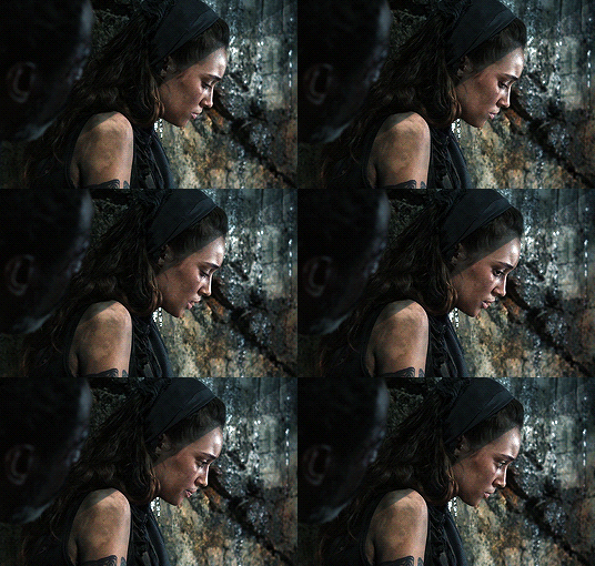
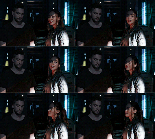
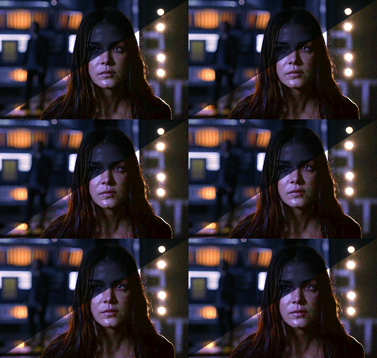
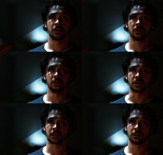
WARNING: This is very long. Everything starts under the cut!
GENERAL GIFFING TIPS
Get 1080p/720p downloads. Since The 100 is already a very dark and grainy show, anything lower will ruin the gifs’ quality.
Make sure you have cropped the gifs to the proper Tumblr size. Click here for reference. And get rid of the network logo when you’re cropping it! It always looks better without it.
Sharpen your gifs! I don’t see any reason why you shouldn’t. Sharpening your gifs will make it look more HD and show off your coloring better. My sharpening is a smart sharpen with these settings. You can go here if you want to experiment with other actions/settings, though.
Do not have any skipping frames. Please. Your gif will look sloppy and won’t be as smooth, therefore ruining the quality of it.
Make sure you have the gif timing right. I usually go for 0.05 seconds because personally I think it looks best, but I’ve seen some who went with 0.04s or 0.07s and that also works well. Go for 0.05s! I realized now other time settings doesnt work as well as 0.05s especially with The 100.
Save settings. My usual go-to settings are these. Though sometimes I went for selective instead of adaptive and it looks okay, too! :)
+ extras: subtitle!
The font you use for subtitles on your gif will also affect the way your gif looks. Fonts that are too big or too small will make it look less HQ, but having the right font with the right size (and the right position!) will make it look good. Here are some text settings you can use that I’ve found: [ one / two / three ]
COLORING TIPS
Now that you’ve kind of gotten the general giffing tips, I’ve listed out some coloring tips that I found out specifically for The 100. All PSDs will be linked at the end of this post.
Adjust your brightness before anything else.
The 100 is generally very dark, but even with scenes that are already not too-dark, you’re still gonna want to adjust the brightness so you can work on the colors better. I’ll go detailed with this one. We’ll be working on 3 scenes, bright, neutral, and dark scenes.
1. BRIGHT/YELLOW
For this one, I used a scene of Clarke from Season 5.
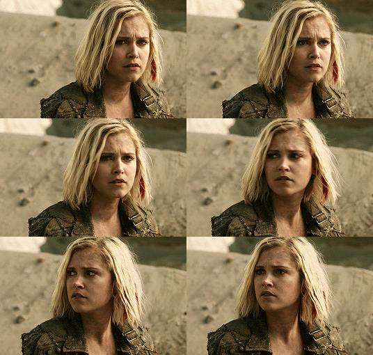
The scene is already very bright, so what we’re gonna do here is to adjust it so it’ll look prettier without being too bright that it hurts our eyes. First let’s do curves. I added two curves layer, the first one is to add just the tiniest bit more brightness to her face, and the second one is to darken the background. and then I’m gonna add brightness and levels for contrast:
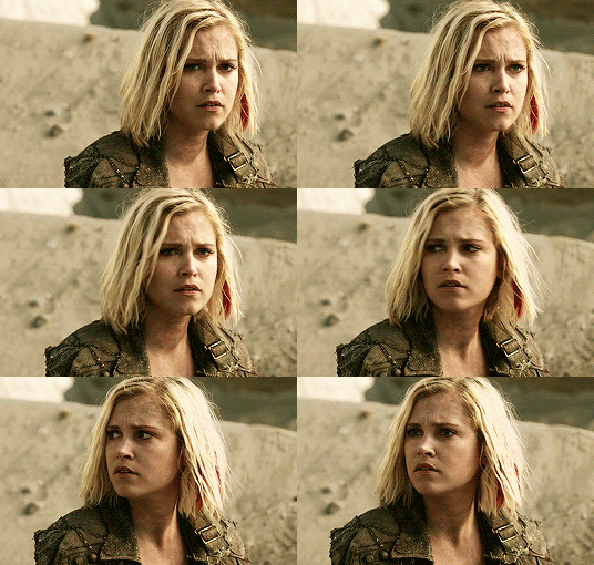
Alright, now that I’m already happy with the brightness, I’m gonna go and adjust the color. This is too yellow for me, so I’m gonna add a color balance layer to and pull up the blues/cyans/magentas

That’s good, but it’s too desaturated. I’m gonna go and add selective layer to make the colors pop up. I adjusted the red, yellow, and neutral and I got this:

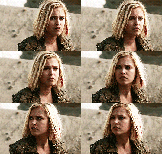
Now this looks great already! Unfortunately, I’m annoying so I have to add more adjustments lmao. This is the final result after being added with an extra brightness layer and a gradient map on luminousity.
2. NEUTRAL
For this one, I’m gonna use a scene of Lexa (reshop heda you’ll always be missed) from Season 2. It’s not very bright but it’s also not too dark.
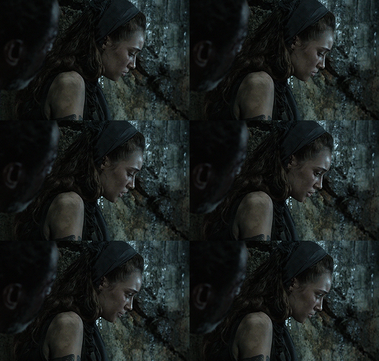
Now the tips with scenes with enough clarity (doesn’t have to be super bright, but if you can still see things clearly) like this one, clicking the ‘auto’ button on curves saves a whole lot of time. I did so and this is what I have in result:

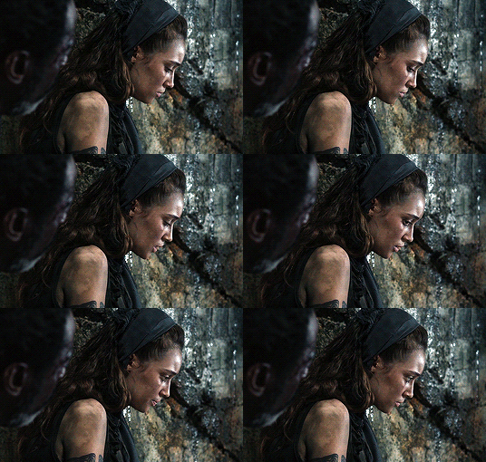
The auto curves will usually brighten the gif and balance the color on it. Often times you still have to adjust it again. But still this will save a lot of time. I added some more brightness and levels before adding color balance and selective colors layer, and here’s the final gif:
Keep in mind that this will only work with some scenes. This will work alright with the Clarke gif above, but it definitely won’t with this next gif we’ll be coloring.
3. DARK/BLUE
Okay now this one requires some work. I chose Octavia’s scene from the Season 6 trailer.
The original sharpened gif (notice that I got rid of the logo! It’s really annoying for me so I always find a way to get rid of it.)
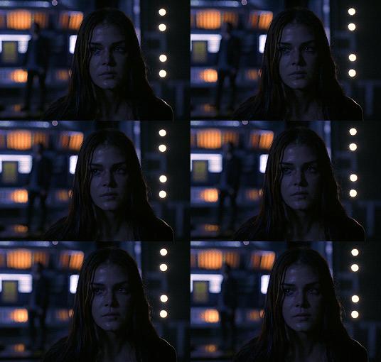
It’s reaally dark. So let’s start with brightening it up a little. I added curves, brightness, levels and more brightness because it was still dark as hell:

Now, you may think it’s already bright enough, but for me personally I can still make it brighter, so I added exposure. With dark scenes exposure works really well. But you have to take it easy with this layer since it affects the gif drastically with very minimal effort. I also added a black and white Gradient Map layer that I always set to luminousity:
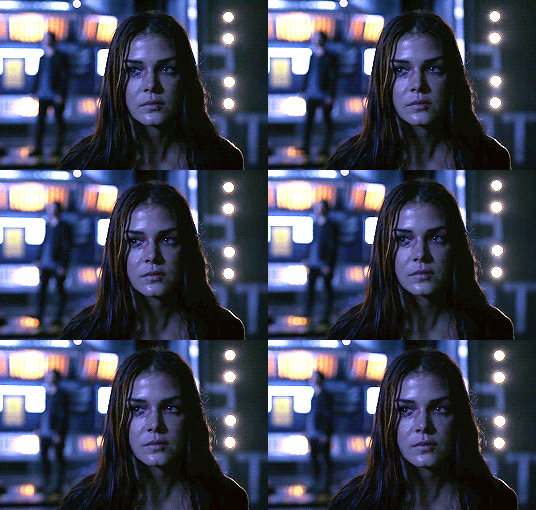
Now it’s time to go and adjust the hell out of the color balance to make it less blue! I also added an extra selective colors layer to make the reds pop out and get rid of the pixelated/grainy blacks on her hair. After that I added another brightness layer. Here’s my final result:

The quality on this gif is not as good as the others since it was from the youtube trailer (1080p youtube video are still low compared to web-dl’s) but that’s basically the gist on how I work on The 100′s darker scenes! :)
Color balance and selective colors.
The 100 lighting often makes your gifs not only too dark or too bright, but also too yellow or too blue. Balancing it out using a color balance almost always helps. Selective colors layer will also help when you want to pop up certain parts of your gifs. Here’s some tips on selective colors that I got from msmarvel’s coloring tutorial.
Selective colors and color balance layer usually go in the middle or on top of brightening adjustments for me. But I found out that color balance could also be done after you’ve done your coloring, but you have to put it under the other adjustment layers to have the most effect.
I’m gonna show you how I edit this gif here of Raven and Murphy with what I’ve said above.
Without any coloring:
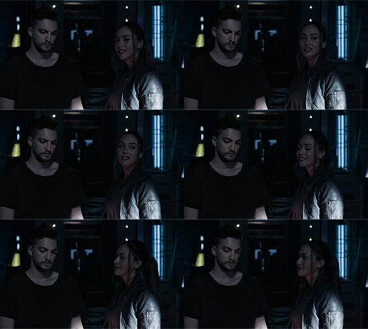
Yeah, I know. I can’t see anything either.
I brighten up this gif using my method above for dark blue scenes. Curves, brightness, levels, and add more depending on what you need. Here’s what I have now:
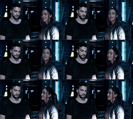
We can see both of them properly now, but it’s waay to blue. Also I’m losing some color from Raven’s skin so I’m gonna add color balance under every adjustment and pull up the reds and yellows.
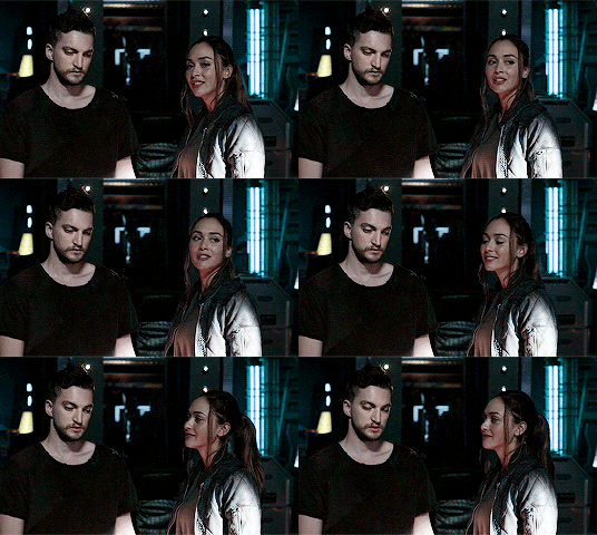
Now it’s better! You can totally leave it here and post your gif like this. but I added an extra selective colors layer to bring out the red, yellows and blacks, and here’s the final result:

I should mention that when it comes to scenes with POCs, you have to be very careful. With this scene with Raven color balance and selective colors helped bring back her color, but on other scene adjusting too much of the red/neutral/yellow might ruin her skin. You are allowed to adjust the colors on a gif extremely when necessary, but be careful about it :)
Some dark scenes are supposed to stay dark.
I realized that with the 100 (or any other shows tbh) brightening up a gif with a dark scene too much will make it lose so much quality and ruin it. So, what I’ve learned to do is to let it be dark. I’ve seen some people brighten their gifs too much and even though I understand your frustration, it’s gonna be better if you just let it be as it is. But, still, make sure it’s bright enough so you can still see the things happening on the gif.
Here’s a gif of Bellamy from Season 5. You can see how dark it is without any coloring:
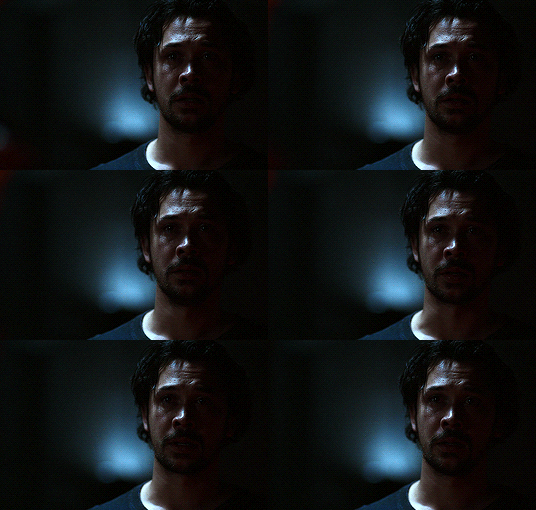
First, let’s brighten this baby up so we can see Bellamy’s face. I added curves and brightness, levels and more brightness:
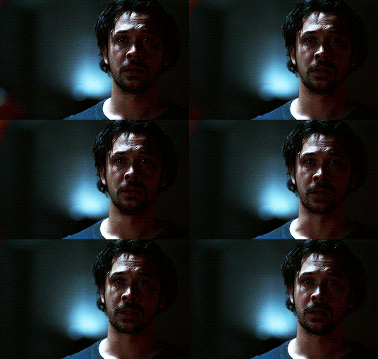
Now I know it’s still very dark, but instead of brightening it up too much I’m gonna go to color balance and add the tiniest bit of red and yellow, and then I’ll add a photo filter. These two adjustments are done so we can have more color on his face instead of the ugly dark red we had. With those adjustments, what we have now is this:
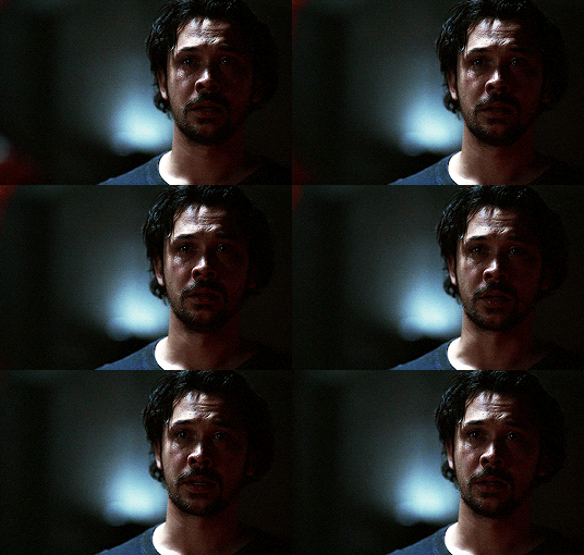
Next, we’ll move on to selective color. This is what I mean when I say you have to be careful with this adjustment. I want to brighten up Bellamy’s face by putting down the blacks on the red selective color. But by doing so I might erase all the reds from his face and whitewash him. To prevent that, while I put down the blacks, I bring up the reds (lowering the cyan) and yellows. I also pull up a bit of neutral and black selective color so I can get rid of the grain (adjusting the black on both selective colors.)
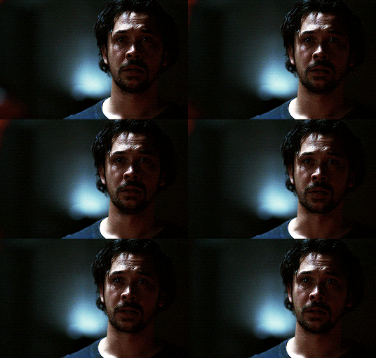
With a little more last-minute brightness, here’s the final result:

That’s pretty much it! You can add more brightness than what I did here (I was in a rush when I made this but I would definitely add a little more curves or brightness) as long as it doesn’t ruin the colors and won’t make the grain too visible.
Now as promised, here are the PSDs I made for this tutorial! Please don’t claim them as your own and feel free to tag me (#useraaya) if you make anything with them so I can check it out :)
[ clarke ] [ lexa ] [ octavia ] [ murphy & raven ] [ bellamy ]
I hope this helps! Don’t hesitate to message me on my main blog if you have any questions. <3
#itsphotoshop#yeahps#chaoticresources#the100edit#the 100#**#gif tutorial#coloring tutorial#*tutorials#*resources#aaya
423 notes
·
View notes
Photo
9k FOLLOWERS CELEBRATION: GIF TUTORIAL by winston-wilson
In this tutorial, I’ll try to show you the basics of making a gif. Of course, there are many ways for this joyful and absolutely not stressful part-time hobby slash addiction, but this is how I’ve been doing it for a couple of months now, and it’s worked out pretty well so far. I’ve learned a couple of tricks, created my own shortcuts, and at this point it’s just something that comes naturally.
I use Photoshop CS5 Portable (you can get it here)
for taking caps, I’m using KMPLayer (get the 4.2.2.22 verison, the .23 one is screwed up - you can get it here)
please, like / reblog if you find this useful
feel free to hit me up with any questions.

1. Don’t beat your laptop with a baseball bat. Yet. Use your chair.
1.1. Videos/clips/movies.
I explained that part in this tutorial. What I want to add is that if you want the highest quality of a trailer, get QuickTime, wait a day or two after it comes out, and get the trailer here.
Find a trailer you’re interested in, play it, choose the highest quality option, press ctrl+shift+i, and you’ll get this:
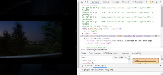
Click anywhere on that html codes and press ctrl+f. This will show up:
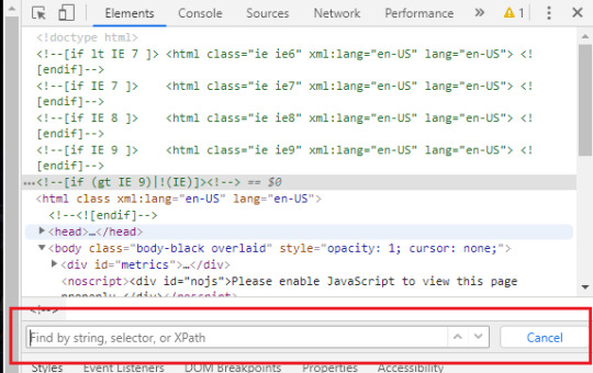
Put that brandy away. Search for ‘source’, find this:

Clink on the blue link using the right-click of your mouse, choose open in new tab, and a download window should show up.
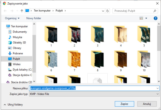
Save the video where you want to.
You can use videos from YT or movies you have on your computer or get those movies. Those movies also should be in the best quality possible. I suggest the ones with quality of 1080p and bit rate at least 6 Mb/s for best gifs.
In this tutorial I’ll be using the trailer of Spider-Man: Far From Home. Because all my movies are on another disk and I, uh...
2. KMPlayer + taking caps.
Before you open a video and take caps, I suggest you create a folder that’s easy to find and use on your desktop. I have one called ‘CAPS’.
- Open your video in KMPlayer. Pause it because this version of KMPlayer stinks and you have to pause the clip in order to start taking caps. So pause it and press ctrl+g. When the caps window shows up, set it to those (red) options and choose your folder (yellow) where your caps will be stored. You have to choose that one thing every time you open that window. [Sorry for the language, but it doesn’t matter. Just choose them settings.)
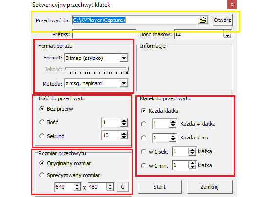
- Play the video & make sure your caps window is somewhere on the side like this:
Find the part that you want to gif. You can pause before it, press start on the caps window and then play the video or just start taking caps while the video is playing. I’ll do it using the first way.
pause:
click ‘start’ on the caps:
and then play the video until I get the caps I want and click stop on the caps window first, the video second.
Close that thing if you have what you want.
- Open your CAPS folder.
Get rid off the caps you don’t need. They’re trash and should be treated as such.
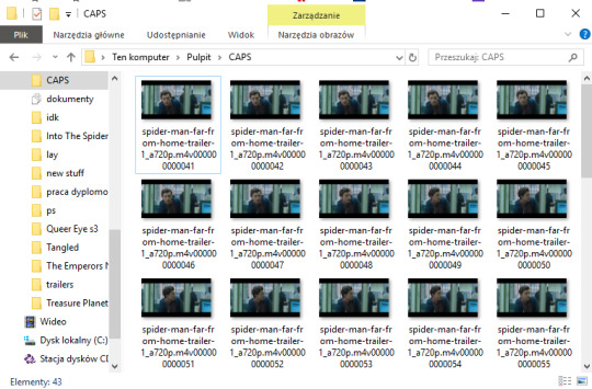
If you’re giffing more than one scene, you can sort them caps to folders. I have 10 folders named from 1 to 10 where I sort mine. And because for now I’m making just one, I’ll move those caps to folder ‘1′ on my desktop.
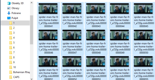
Time to make a gif. You good out there? If the answer is no, take Vicodin. No worries, when you’re done learning the basics, you’ll make gifs with Britney Spears playing in the background. Now shhh, focus.
3. Photoshop, aka that scary part.
- When you install it, you’ll get a folder, and in that folder there’s the app.
- Open that thing (and maybe copy on your desktop).
What you need is the layers window, the actions window, the adjustments window, the characters window, the animation window, the paragraph window, the history window... It... It sounds horrifying, I know, but cool your pits. It’s just this:
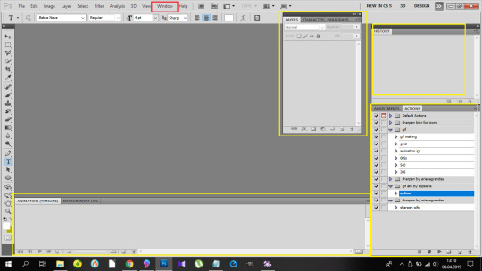
If you’re not laughing, take another Vicodin. Use this if those windows aren’t on display automatically:
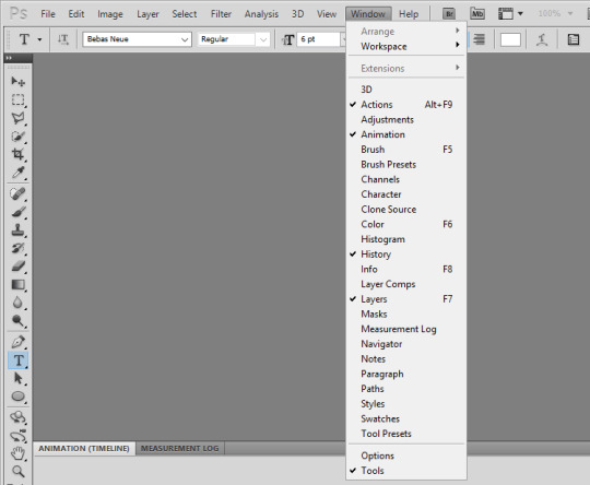
And sort them. Now, I use my own keyboard shortcut for gifs. I suggest you do the same. Trust me, you don’t want to do this:
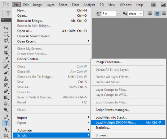
every time you make a gif. As you can see, I use alt+ctrl+p. You can set your shortcuts using the ‘Edit’ window at the bottom of which you’ll find the ‘Keyboard Shortcuts’ thingy. Then it’s a bit of digging but it all makes sense, ok? Ok. Yeah, no, it’s a lot of digging but I believe in you.
So you load them files, and this shows up:
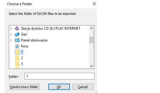
so choose your folder where your caps are, and click OK. Ta-dah:
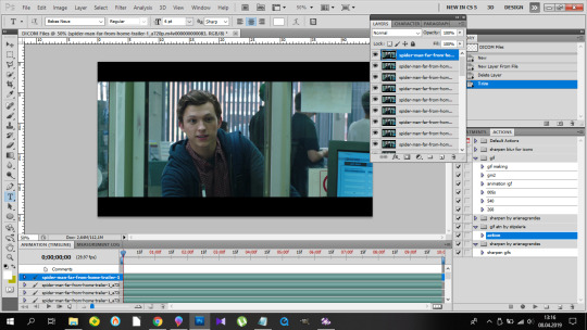
- This is the ‘make gif’ part. Click this:
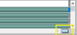
so you can get this

at the bottom. I have this whole process made into an action, and if you want it in an action too, at this point you should click this:

and choose ‘New Action’. Name it. Click record.

and now 1)
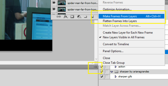
2) take Tylenol
2.1.)
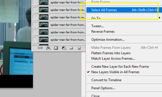
3)
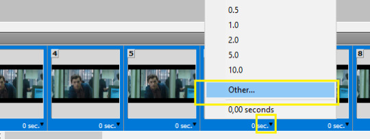
4)

5)
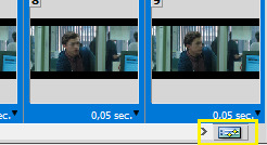
(you should be here now:)
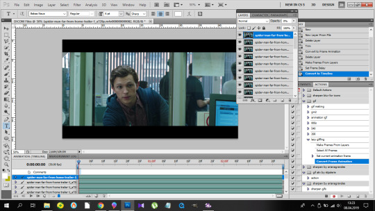
6)
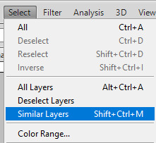
7) (right-click mouse)
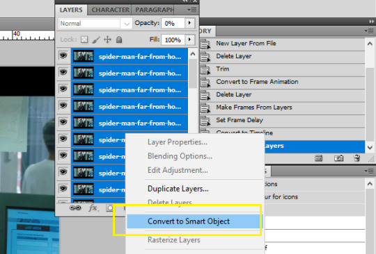
8) stop the action recording here:
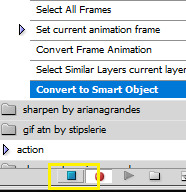
And this is how you should be looking right now:
Oops, not this. This:
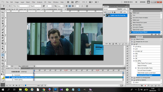
Fine? Fine. Go smoke a cigarette.
You back? K.
- Dimensions. Very important. Like, 10/10 important. Don’t cross the 3Mb size.
Fitting into the tungler dimensions means your gifs will be posted in the highest quality. This is a visual of those dimensions (depending on how many gifs per row):
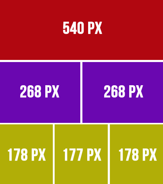
If you don’t do that, your gifs will look like blurred filmography of Zack Snyder’s.
I’m gonna make a 253px gif so it won’t stretch in that post. Gifs over I think 268px stretch on normal posts as in posts and look ugly.
So that brings us to the next steps.
- Cutting, resizing. Easy. Don’t panic.
choose that tool:

set your... this:
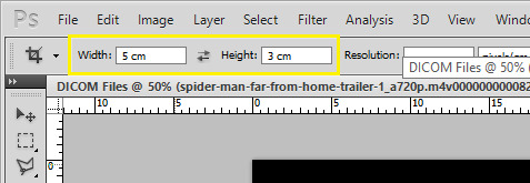
(make sure it’s ‘cm’, otherwise you’re screwed) and crop, baby, crop. I suggest the biggest area you can, of course without the black parts.
Also, depending on gifs, the dimensions can be different. For my 540px gifs I use 5x2 or 2x1 or 16x9. For my 268px gifs I use 11x7, 11x8, 5x3, 1x1. For the 177/8/7px ones, I usually use 3x5 or something. Just make it look nice. Not too thin, not too high.
Ok, so I’m cropping.
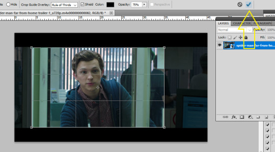
And now resizing. Crtl+alt+i.
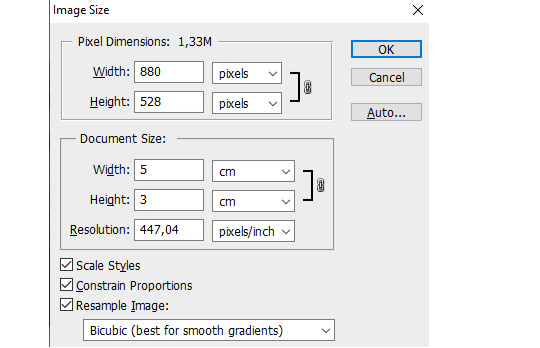
Make sure this thingy looks like that:

My width will be 253px, you make it 268, alright? Or something. Just don’t cross 540px. And put that beer away.
So I have this now:

Doesn’t look appealing, huh? Yeah.
Also click ctrl+’-’/’+’ to zoom in/out the gif.
- Sharpening.
Some people use actions, some do their own thing, I use an action. I’m lazy. And I don’t look forward to just... You know. Clicking a lot. So I use this action. Download it, make sure you like or rb that post, and upload the action using this:
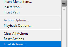
Find your action. Load. Choose it, click play.
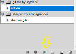
So this is how the gif looks without:
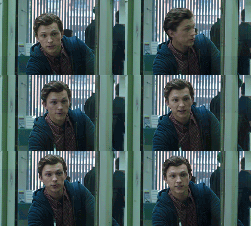
and with the sharpening:
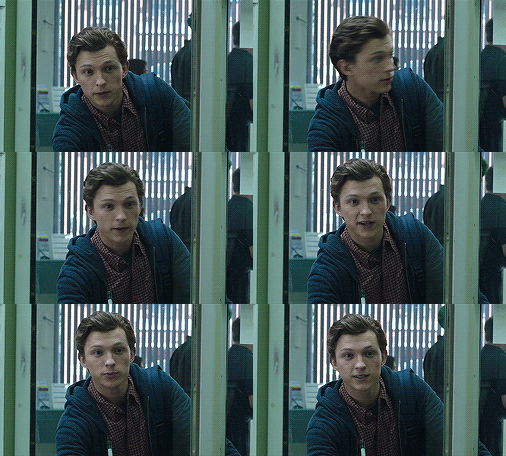
Magic, I know. Okay, you can have that beer. Or no, don’t mix alcohol with pills.
- Coloring.
This is the fun part. That’s where vodka comes in. The part with 390248 times you get frustrated and your laptop is in danger because it can never know when it will join the doves behind your window in a short fly. Anyhoo.
Start from brightness. This is one little trick I learned. You can use these options:
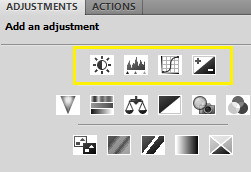
I start off with doing something else. I choose the first option, aka Brightness/Contrast, and when it appears on my layers window, I choose the ‘screen’ option.
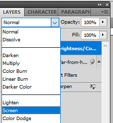
So I’ve gone from this

to this
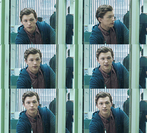
It’s clean. It’s cute. Brightens the whole gif.
Of course, you can do it traditionally and/or adjust the opacity of that ‘screen’ layer. I think I’m gonna brighten it just a tiny bit more and add some contrast.
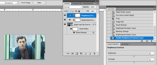
Now cooolors. I’ll make a standard gif, nothing crazy. You can go crazy if you want to, just don’t make someone’s skin orange. It just... doesn’t look good, kay?
Kay.
Those are my options:
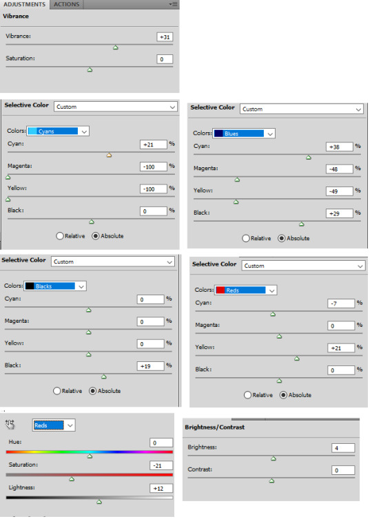
And this is the result:

Save your gif using this (once again you can see my shortcut)
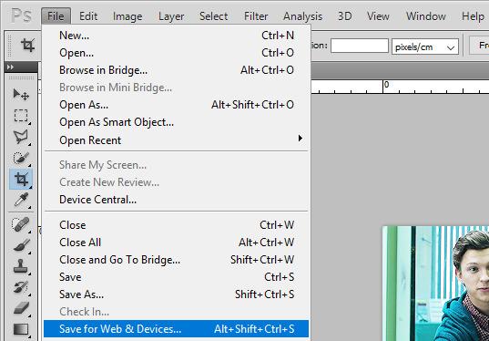
and your settings should look like this:
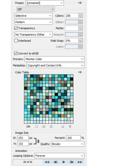
Click save, name the gif, save it wherever you want. And it’s done.
As a bonus we’ll go through...
4. Text on gif.
I use Arial Rounded MT Bold. You can use Calibri, it’s the one I used to use.
Choose this:
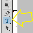
Click on the gif. Write your text. It looks like crap.
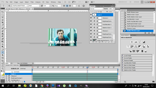
No worries. Choose the text (ctrl+a). Choose your character window. And manipulate until you get the result you’re happy with. Change the size of the font, the distance between letters and paragraphs (and choose the paragraph window to make the text centered).
My options:
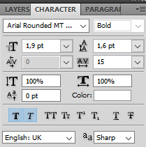
and result:
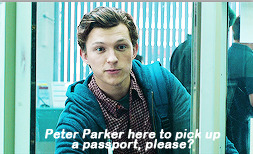
Doesn’t look nice, we want it nice and clean and all that jazz. So. Back to the layers window. Choose that text layer and find this button
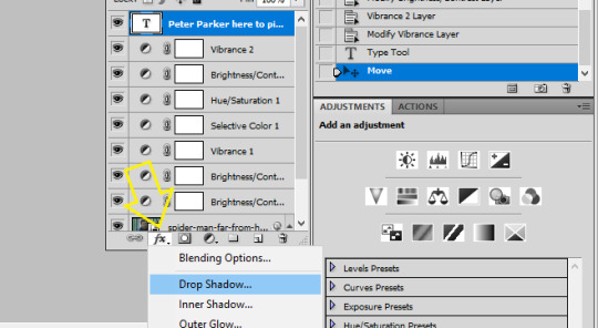
and choose drop shadow. When a window pops up, choose those settings (those are the ones I use:)
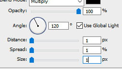
Then go to Stroke on your left and set it like this:

And click ok, and that’s the result:

Tips:
- create shortcuts. saves time, - make gif actions. saves time, - make sure you use the tumblr dimensions, - don’t do orange faces, ok? - when setting the text on your gif, you can do this little trick so it’s in the center:
x if my gif is 253x wide, the center is in 126,5, I make it 126px.
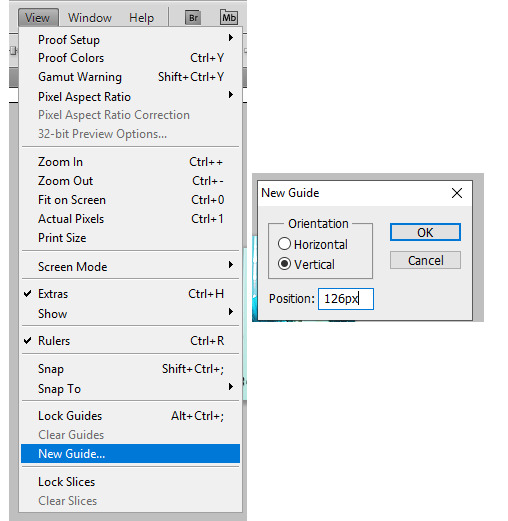
(make sure to write that ‘px’). click twice on your text layer, and this is the middle of that layer:
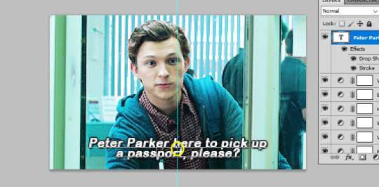
while moving that layer you should be able to see that tiny square and it’s the center of your text. Set it on the guide and you’re done. It’s centered.
- use these


to cut your gif. - play with the opacity and layer settings. for example, if you use color selection or saturation, you can set the layer’s option to ‘color’ and have it 70% opacity. - you can save the text layer only and reuse it by using ctrl+shit+s and saving it as psd

and then just open it again anytime with ctrl+o and duplicate it to the gif. - have fun with it. don’t throw your laptop out of your balcony, they’re expensive.
If you have any questions or want me to make a different tutorial on coloring or something, don’t be scared, I don’t bite (for real, I have braces, biting hurts).
I hope I helped and making gifs doesn’t look like magic to you anymore.
#completeresources#fyeahps#userlance#userjessie#biafrnc#userariella#photoshop help#ps help#making gifs#gif tutorial
391 notes
·
View notes